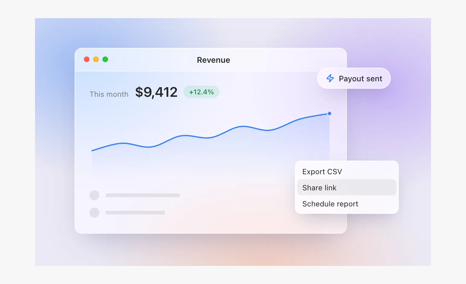
Mock
72 faux product scenes: a believable screen, simplified to what the viewer needs, framed with intent, and every motion with a cause. Open one to play it frame by frame and copy its Vue source.
72 examples
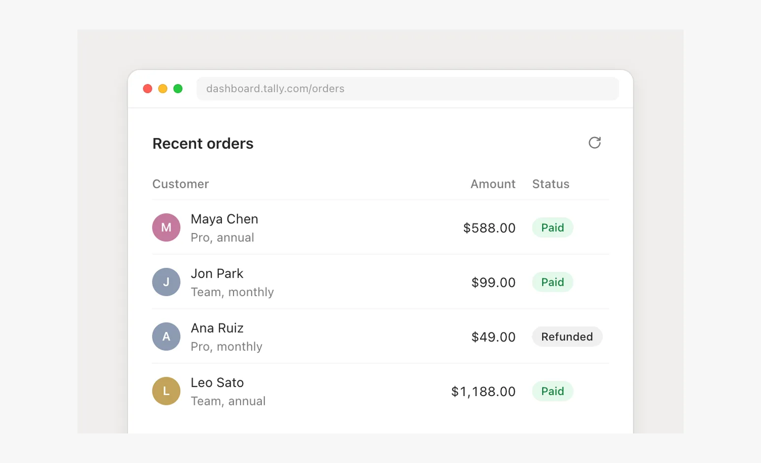
- Static cardScenes
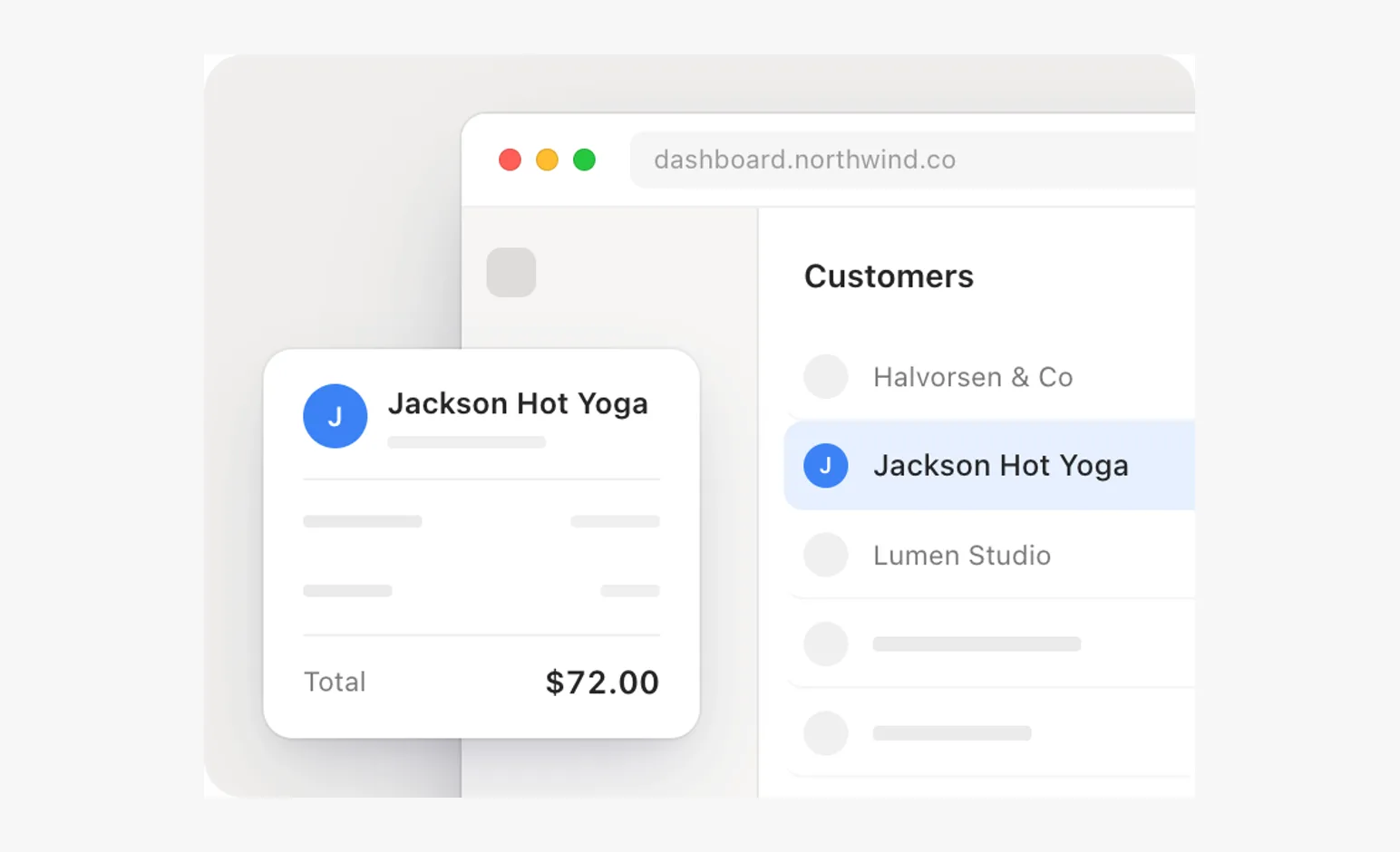
Quiet hierarchy, a hard crop, one satellite, real words only on the selected customer, its neighbors and the total.
- Dark cardScenes
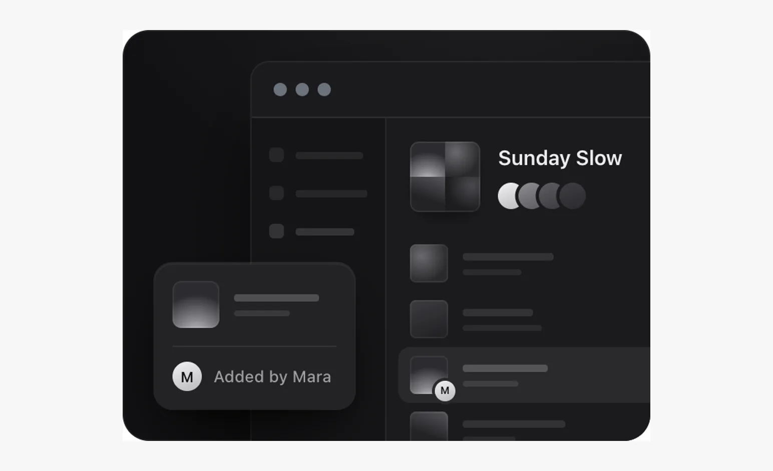
One signal said once; album art keeps it a music app.
- Hero demoScenes
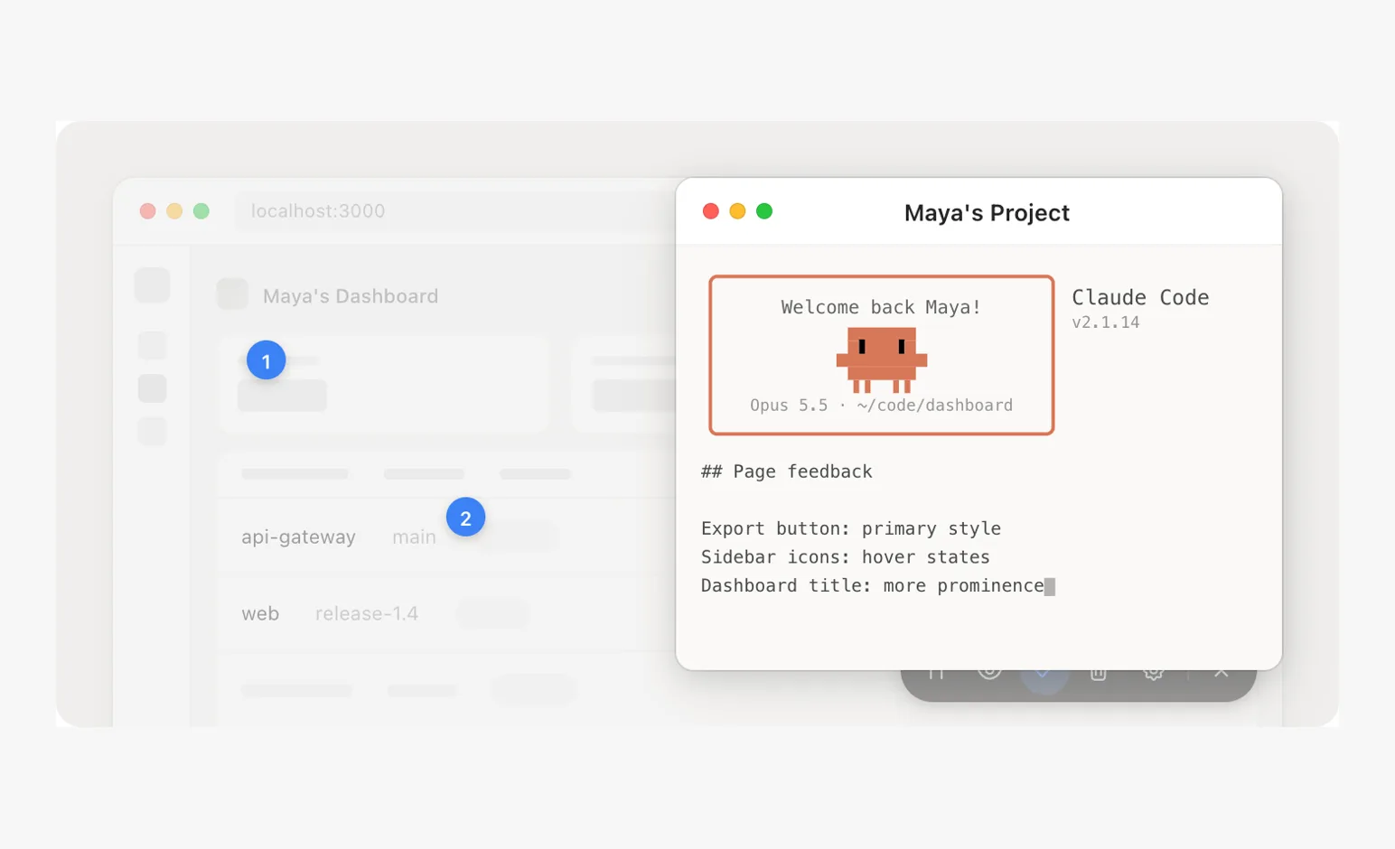
Five beats, named targets, an annotation, a terminal coming forward.
- Payout flowScenes
Slow overlapping arrivals, reading time, a payoff that holds.
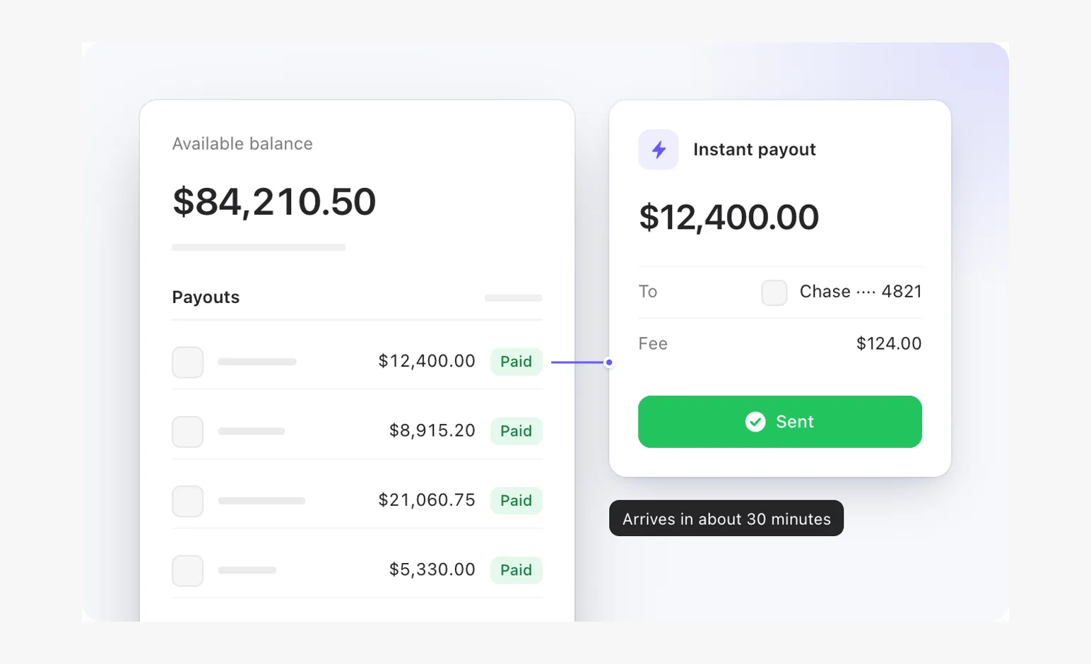
- Changing marketsScenes
Retained tracks, soft masks, dependent timing.
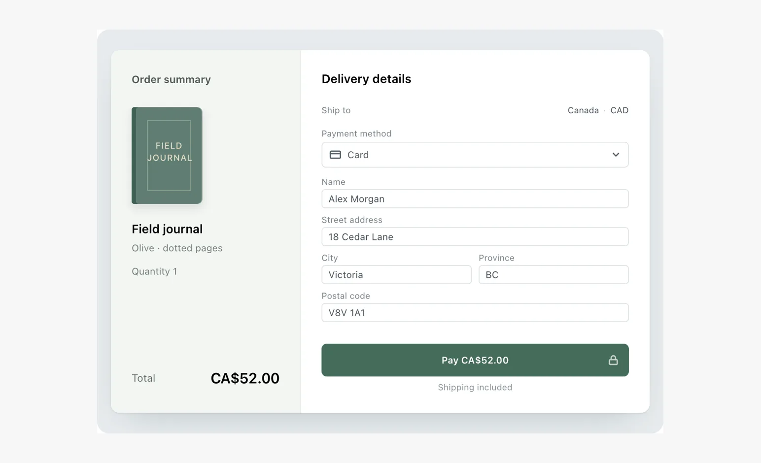
- AI answerScenes
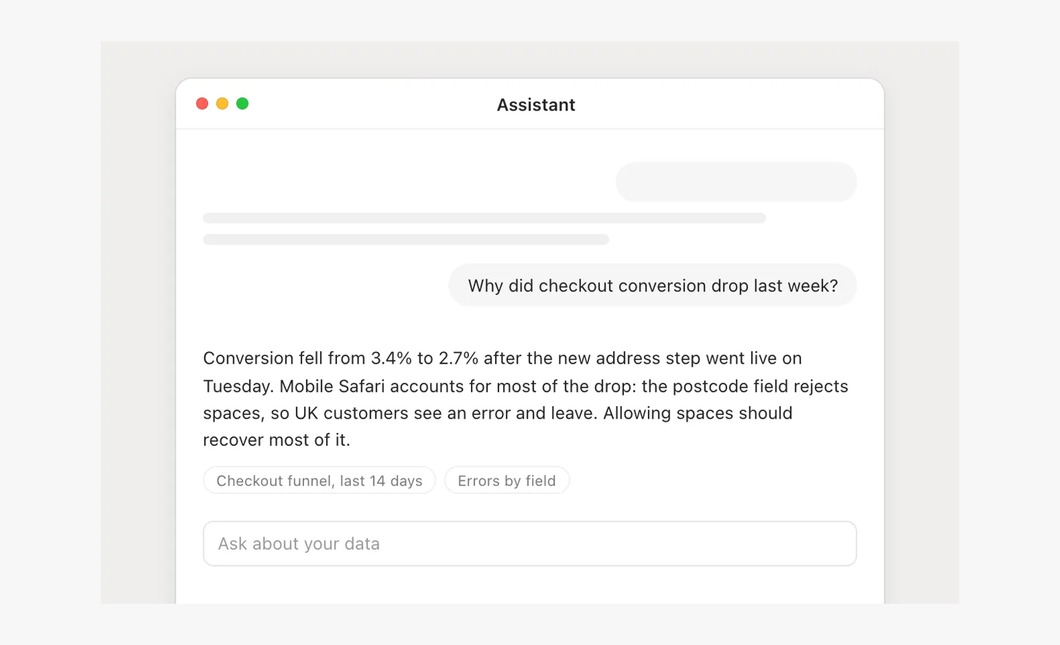
The question sent, Thinking, the answer streaming in with its height, sources last; no sparkles, no purple.
- AI with cardsScenes
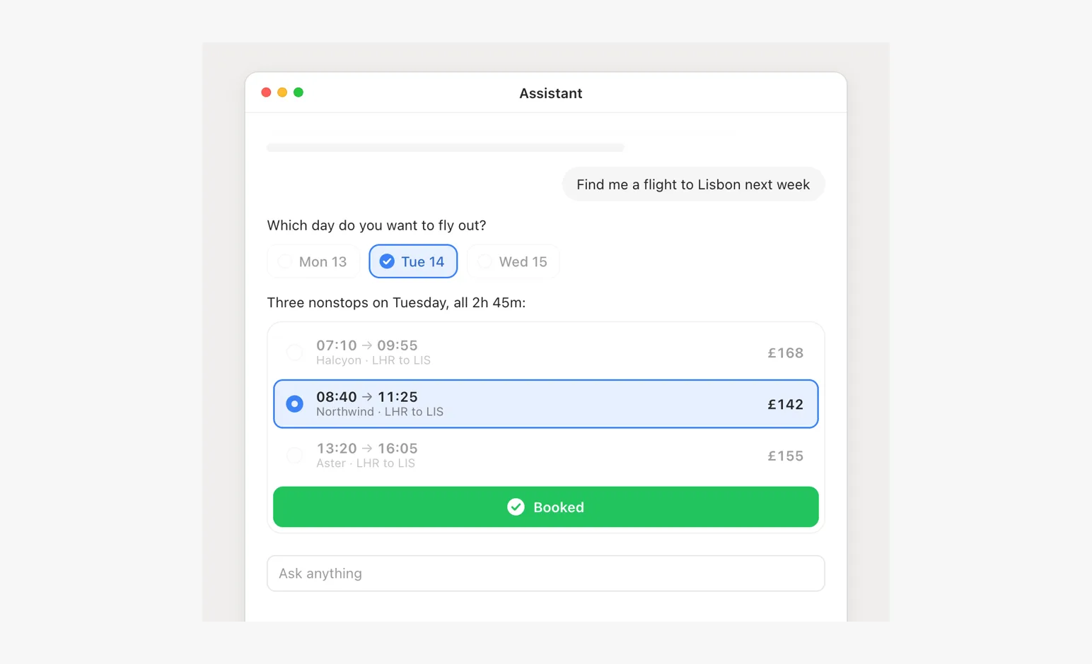
A multiple-choice card answered and kept as the record, a card of options opening in the thread, booked from its own button.
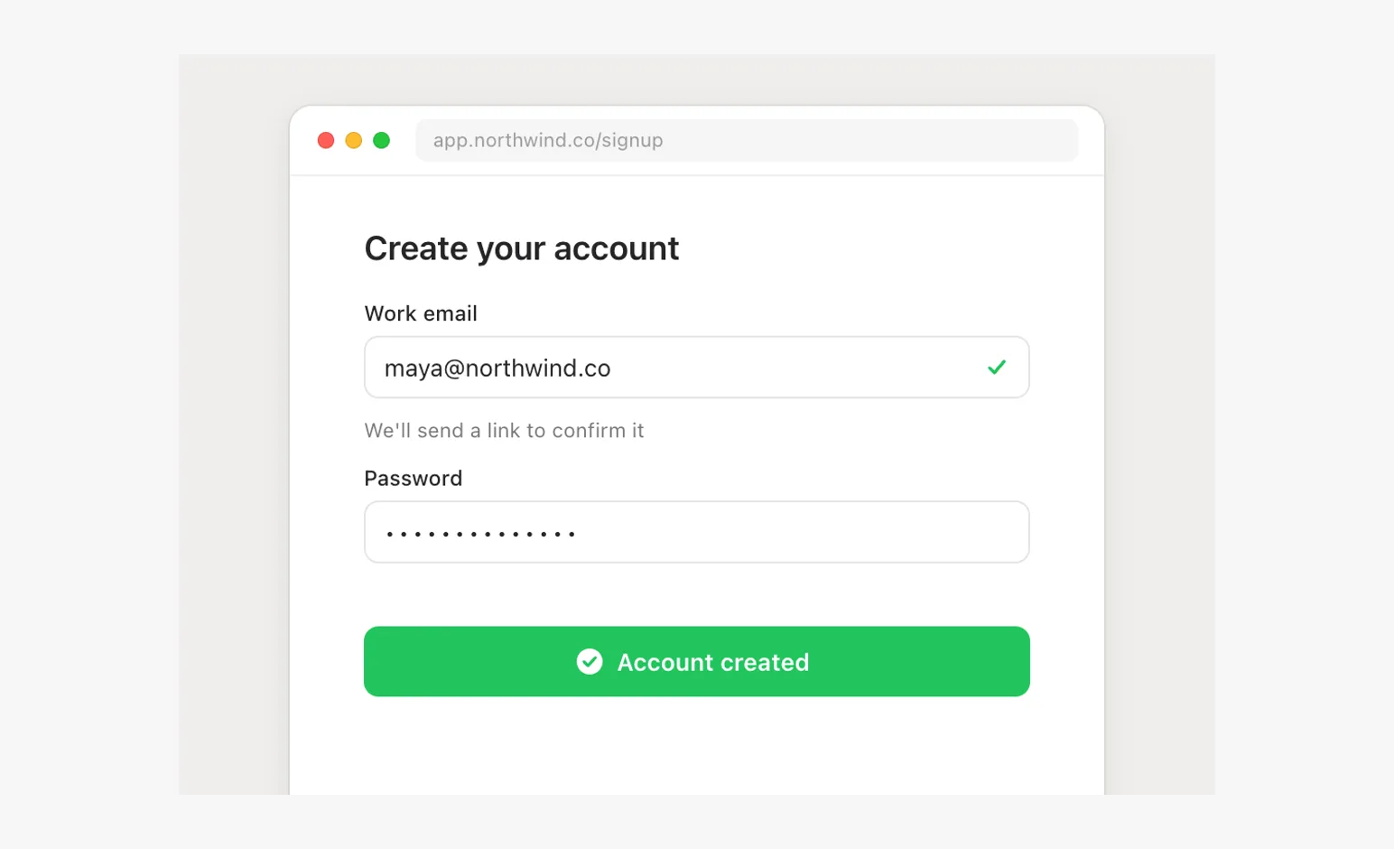
- Form validationScenes
An error on the field that caused it, cleared by fixing it, then the button confirms on itself.
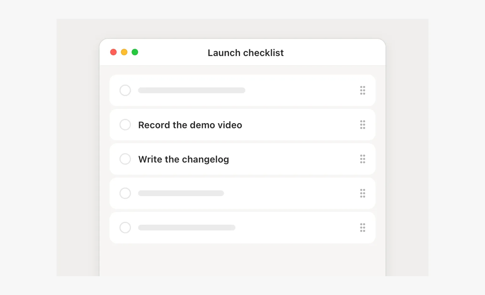
- Drag to reorderScenes
A row lifted by its grip, the others making room, dropped into place.
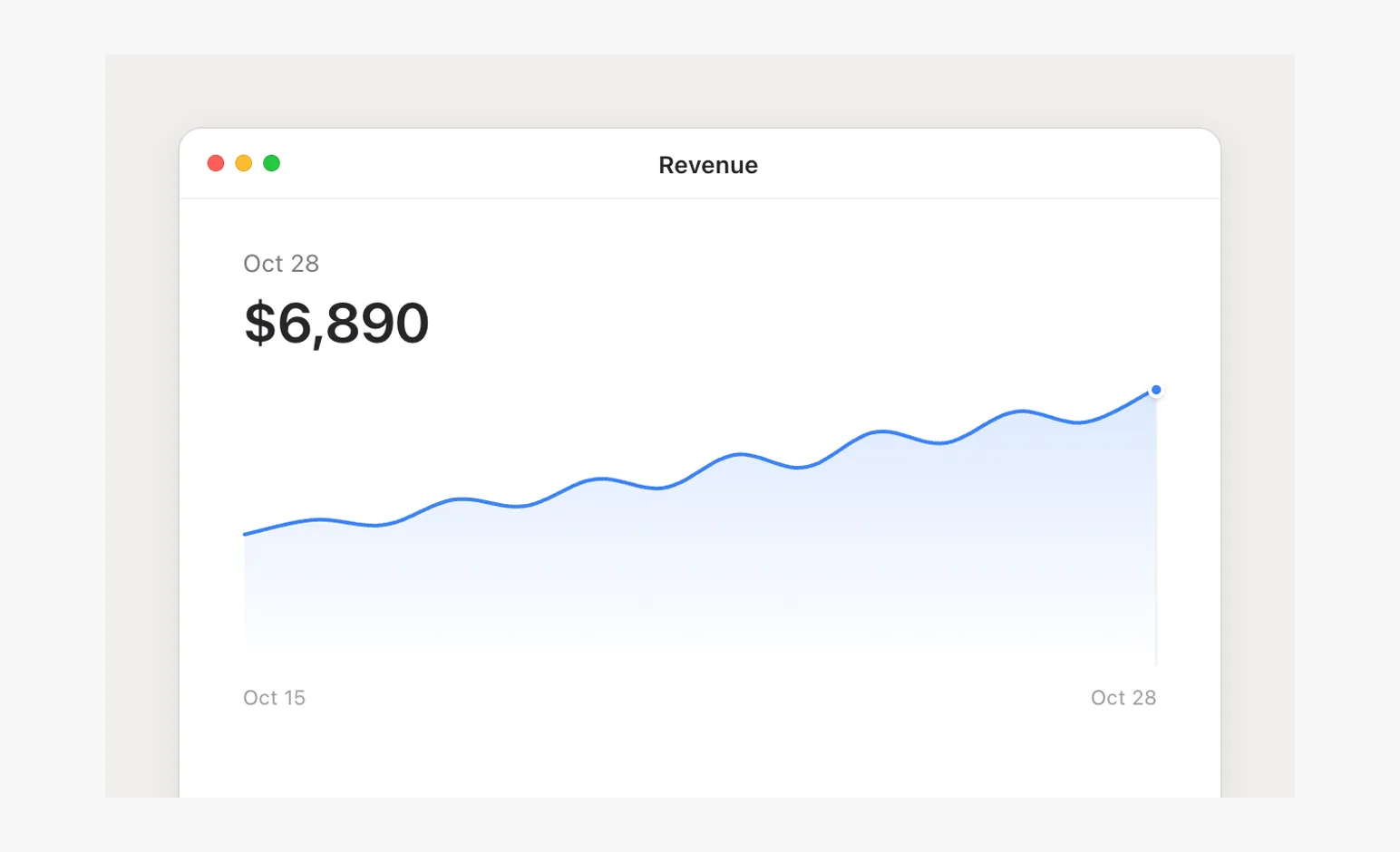
- Chart scrubScenes
A hairline and dot that follow the pointer, the headline value rolling to the day under it.
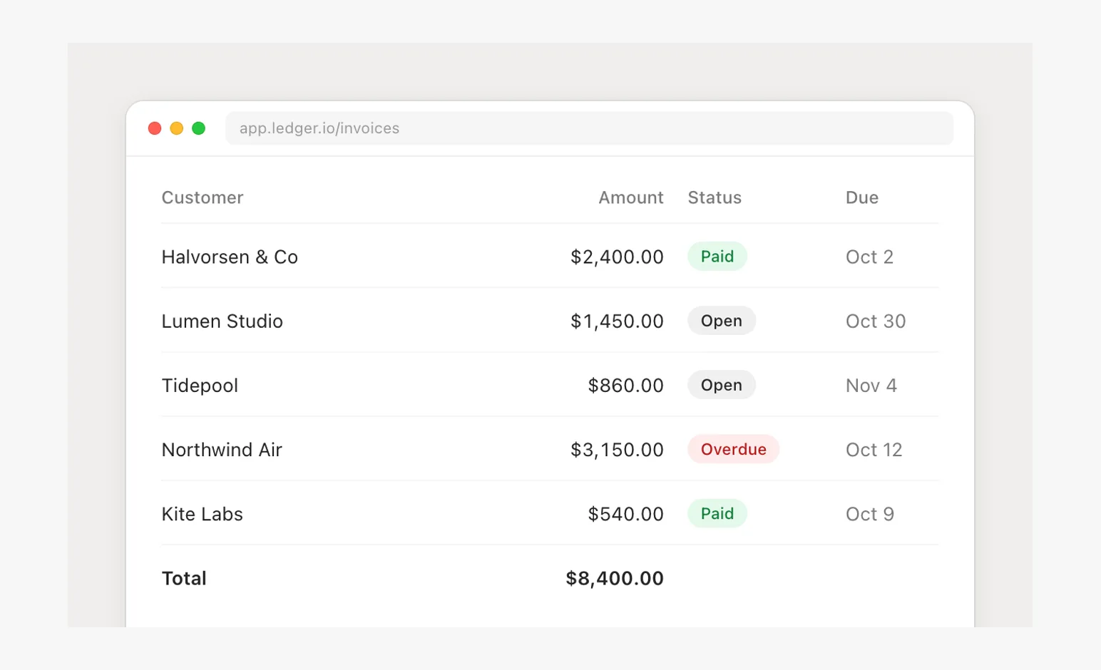
- Edit in a tableScenes
A cell edited in place, then the total it feeds rolls a beat later.
- Loading to contentScenes
A skeleton at the content's own geometry, rows resolving top to bottom, real chrome throughout.
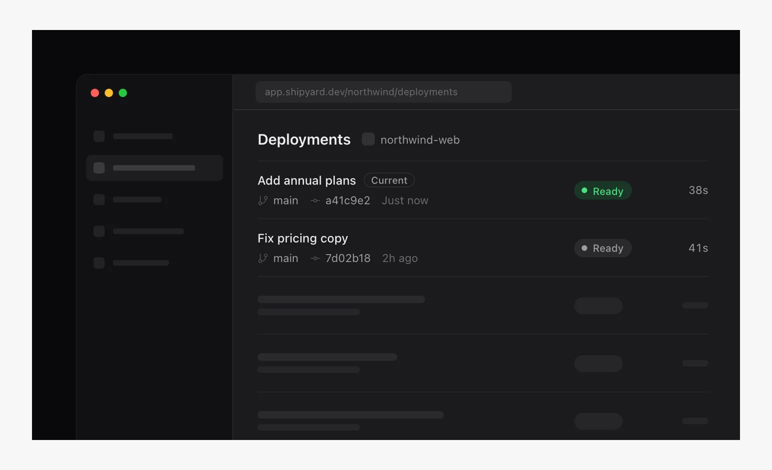
- Dark heroScenes
Depth from surface steps on black, one lit color, a status that changes on its own pill.
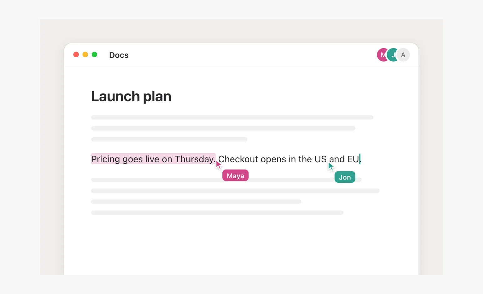
- Live collaboratorsScenes
Each person one color everywhere, names riding their cursors, work shown in the doc's own marks.
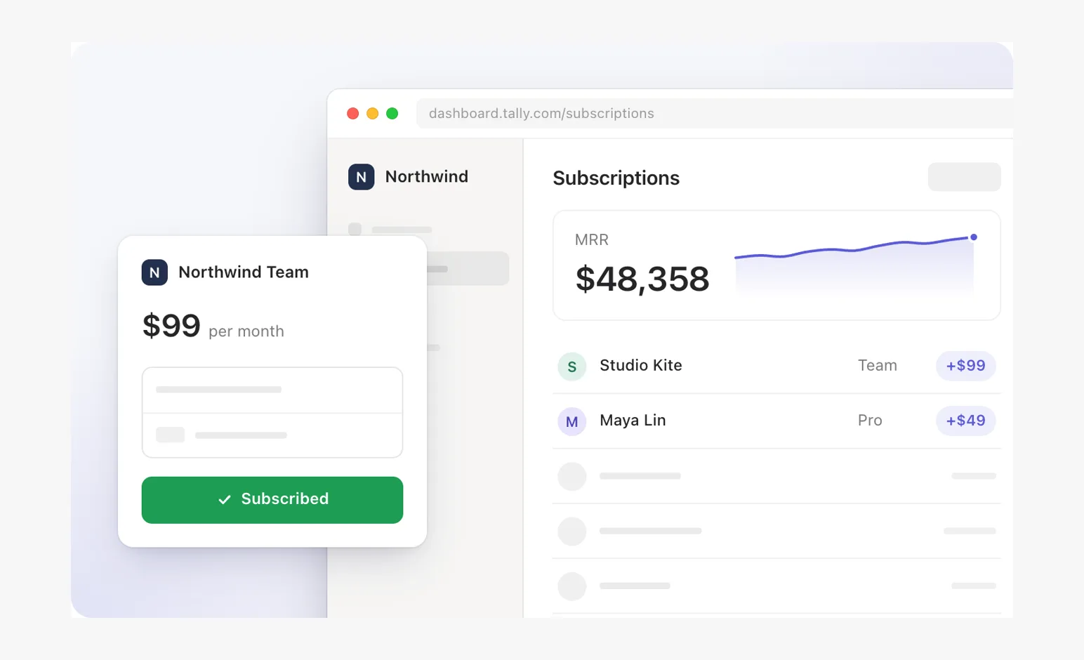
- Subscription handoffScenes
A chip flies into a row, MRR rolls, a second scene is the reset.
- Close-upScenes
One control at 1.4x with its window's chrome, the row whole, a large cursor to match.
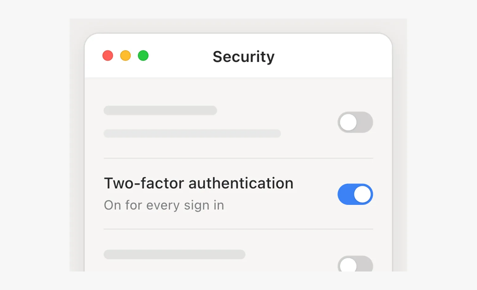
- Many of oneScenes
A grid of one thing off every edge, one tile in focus by depth, the only one with words.
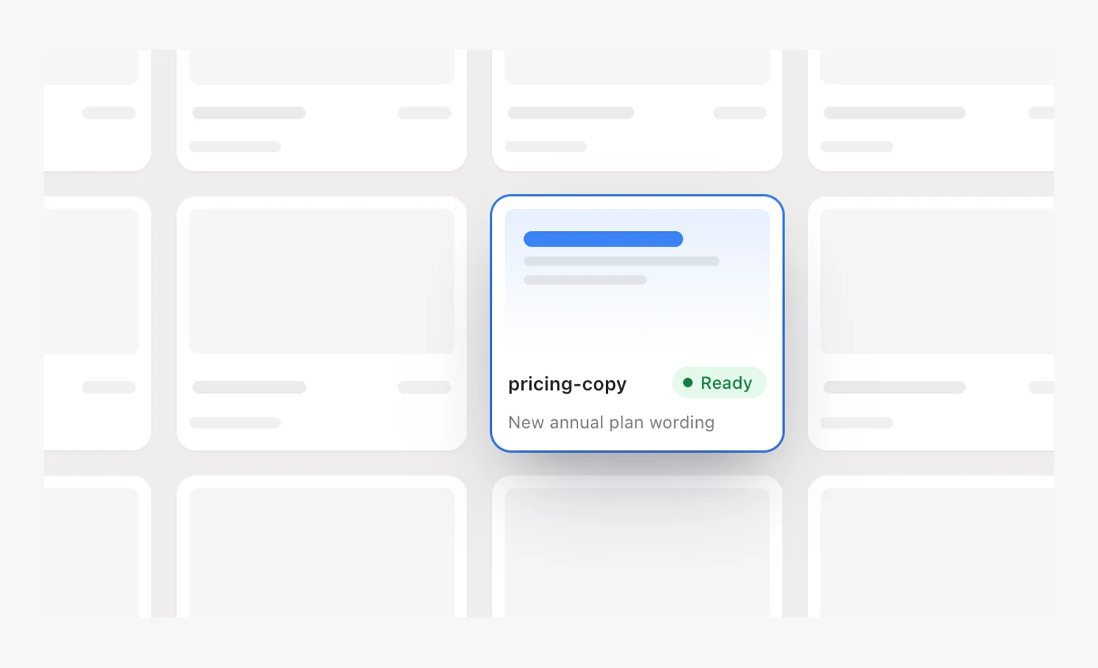
- Fade cropScenes
A window fading out at its foot, over filler, instead of running off an edge.
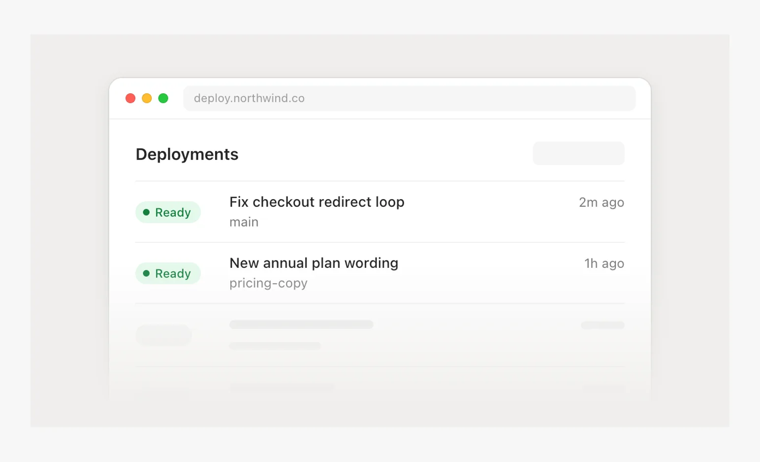
- Panel over productScenes
A settings panel over the product's margin, one leader from the setting to what it changed.
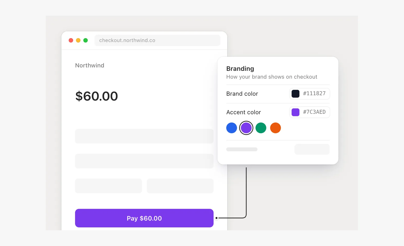
- Overlapping windowsScenes
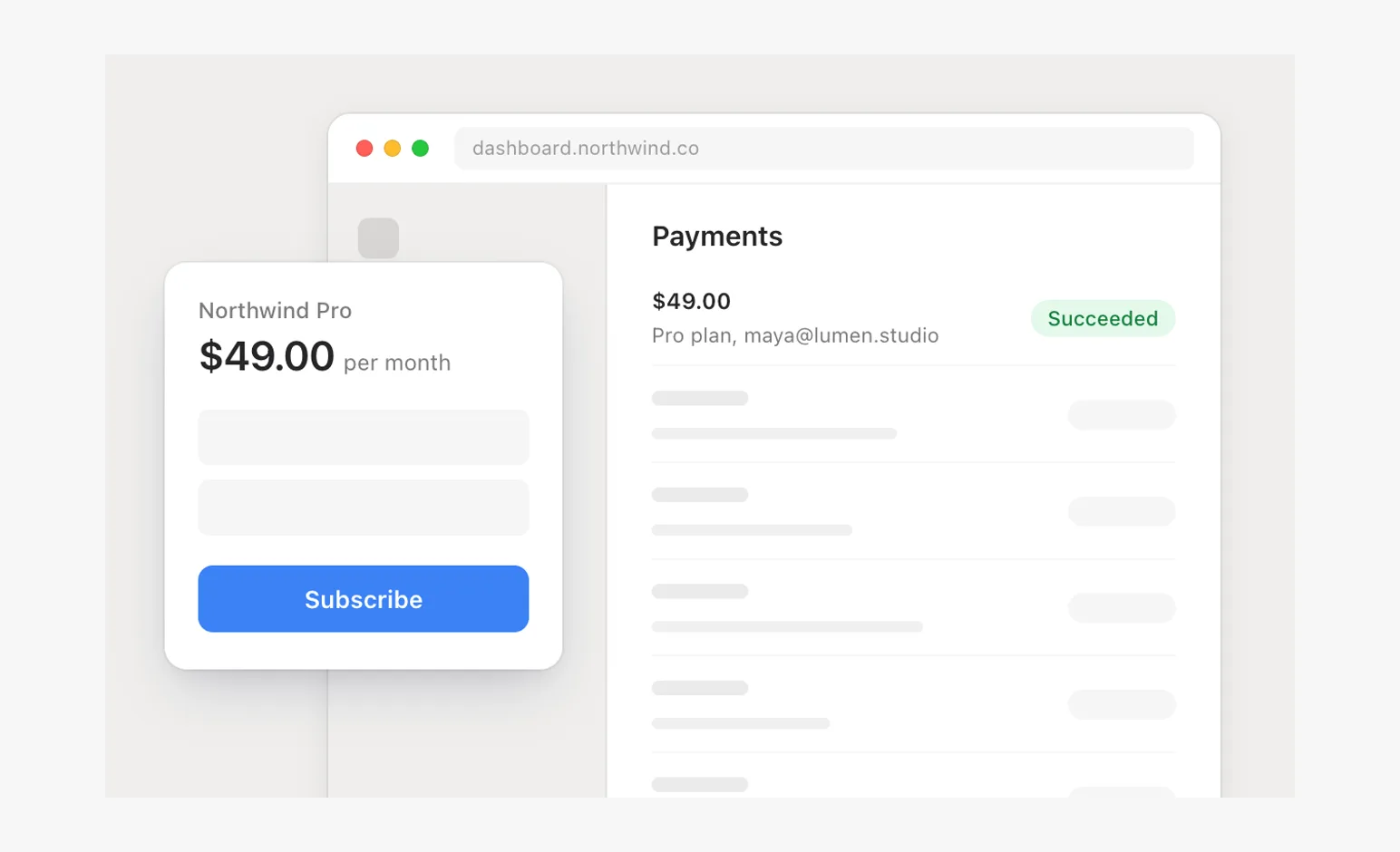
A card in front of a window, its edge on the window's sidebar line.
- Stacked cardsScenes
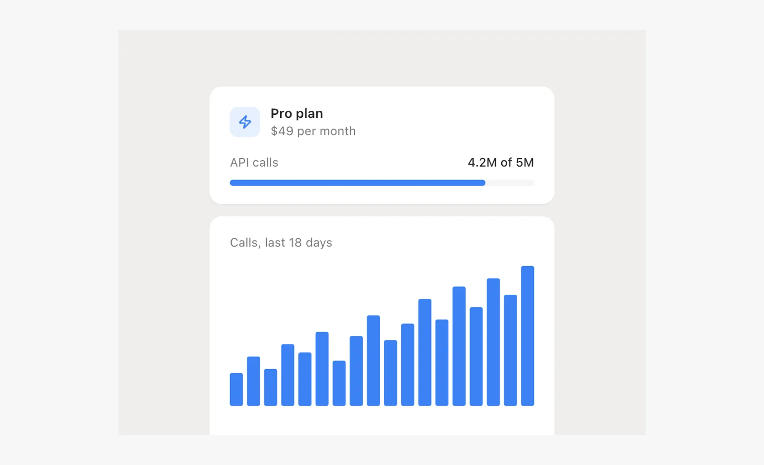
Two components at one width, a small gap, the lower one off the bottom.
- Opposite cornersScenes
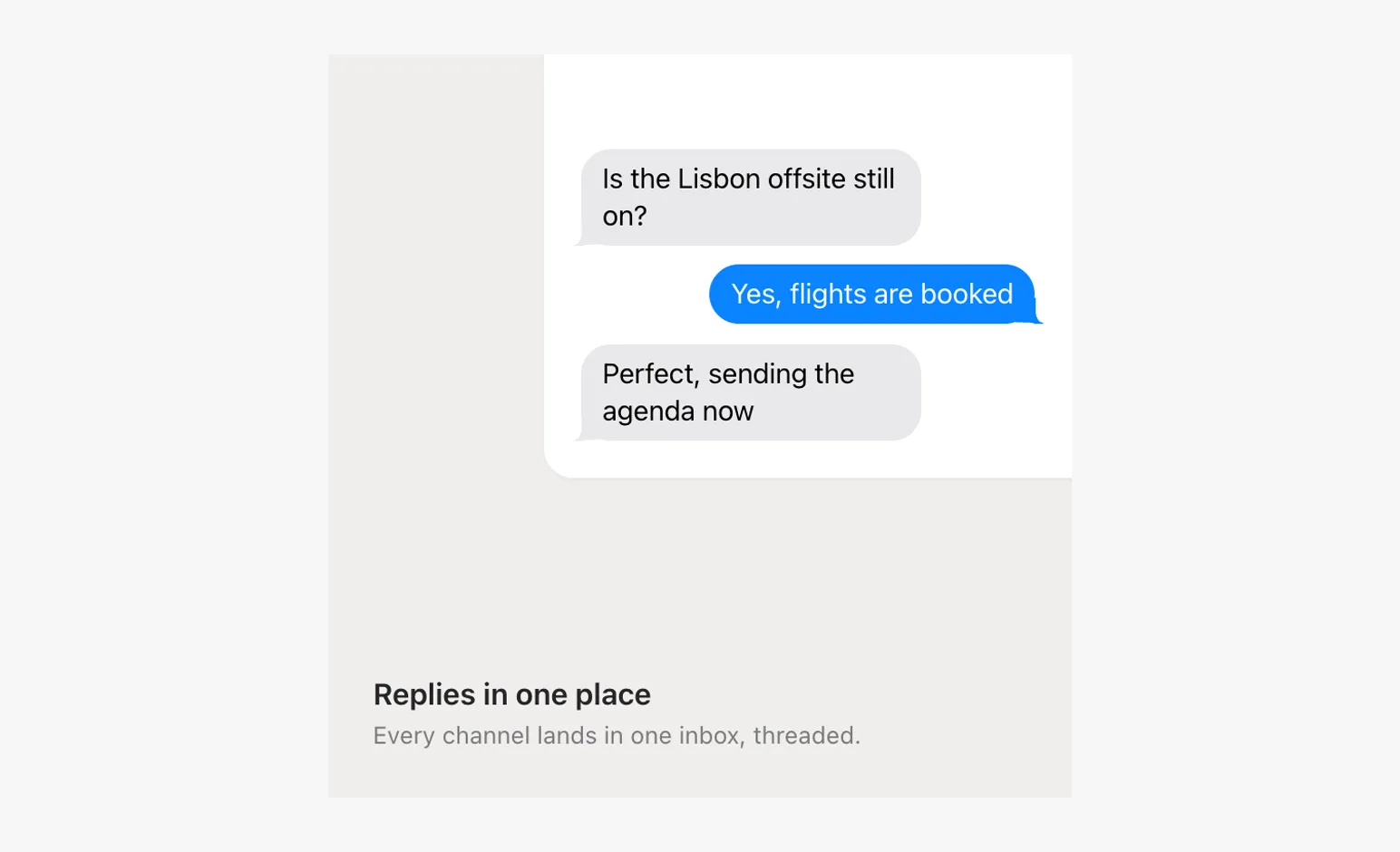
A bento tile: copy bottom-left, the product hung from the top-right corner.
- Tilted stackScenes
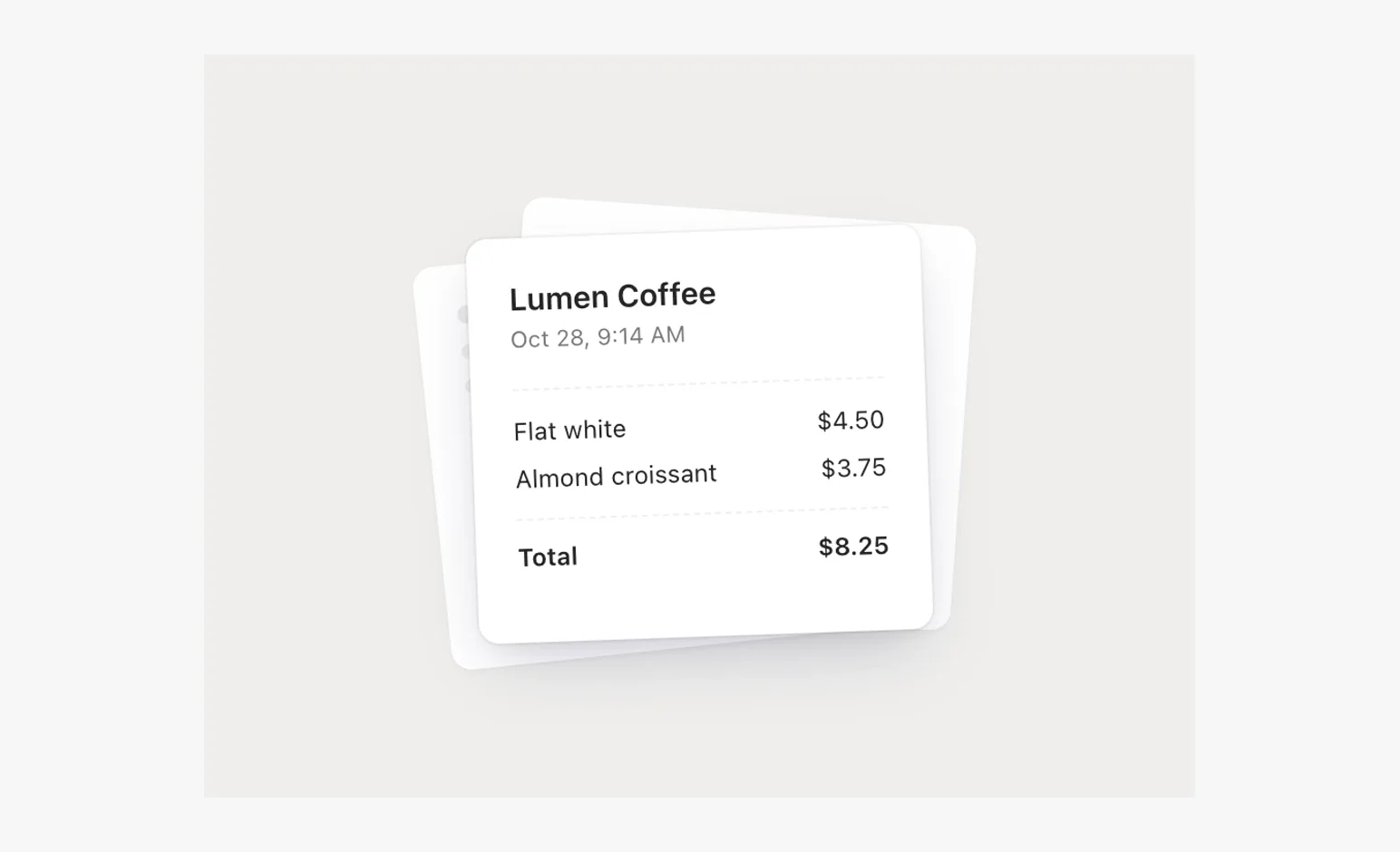
A loose pile of paper, small alternating angles, only the top card has words.
- Corner chipScenes
A small chip centered on a window's corner, half outside.
- MonochromeScenes
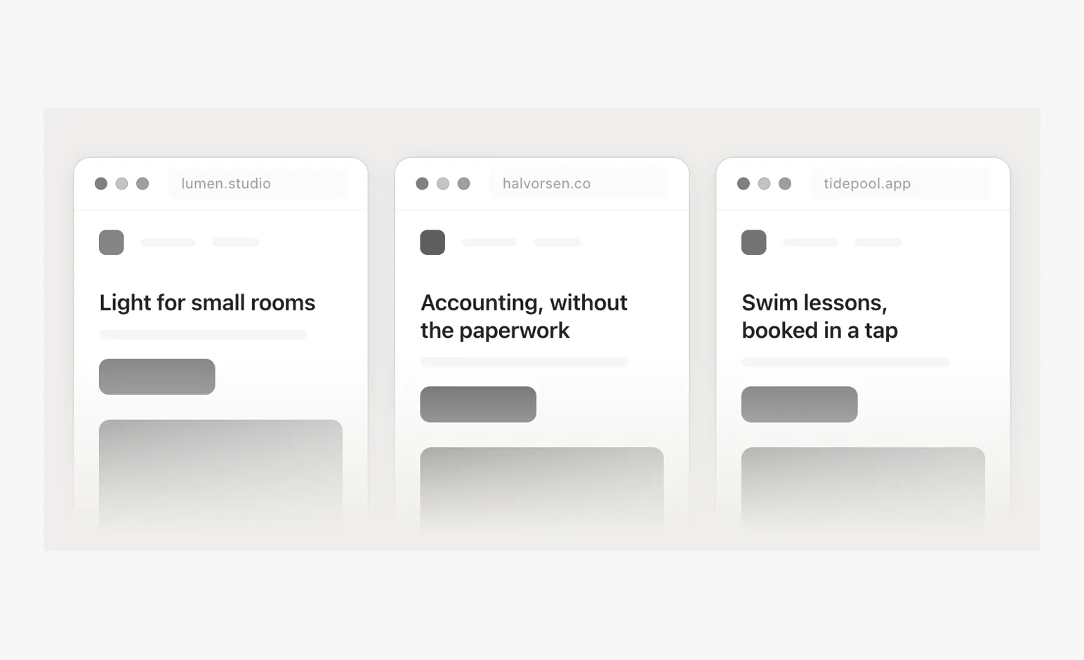
Other companies' products in a row, grayscale, faded at the foot.
- Row of windowsScenes
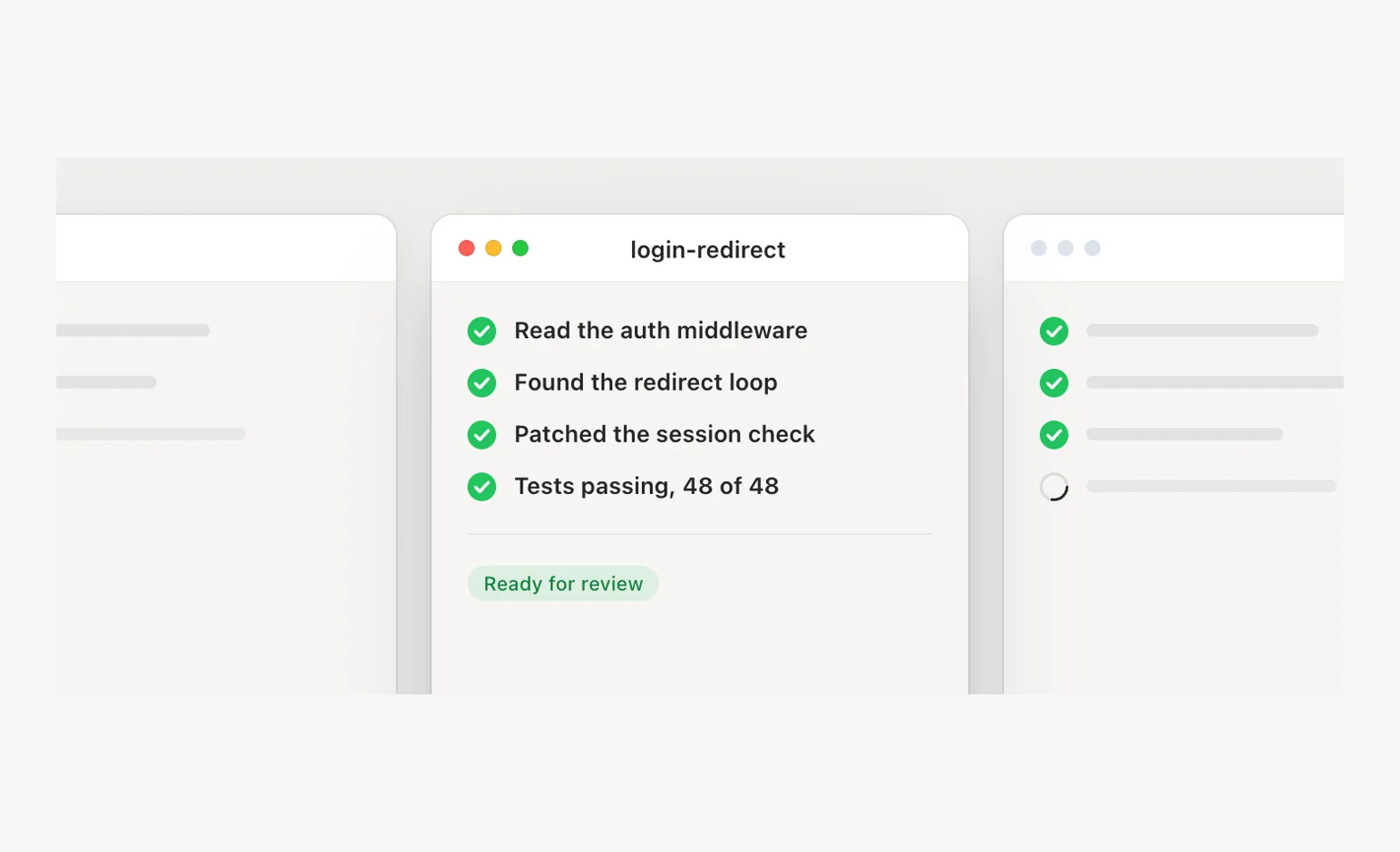
Sessions side by side at one height: focus by depth, neighbors cut by the stage, only filler cropped.
- Window and phoneScenes
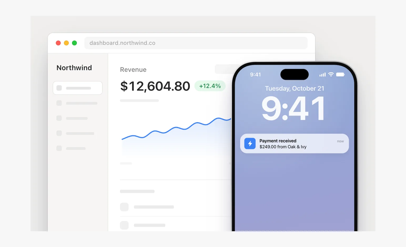
A dashboard and a lock screen telling one event; the phone straddles over margin, never over the figure.
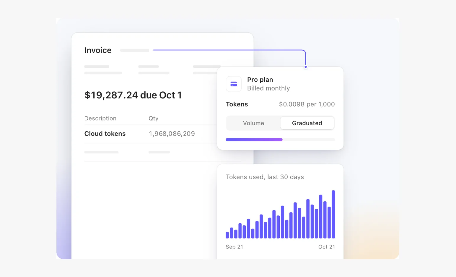
- Invoice storyScenes
An invoice, a plan, a connector, rolling totals.
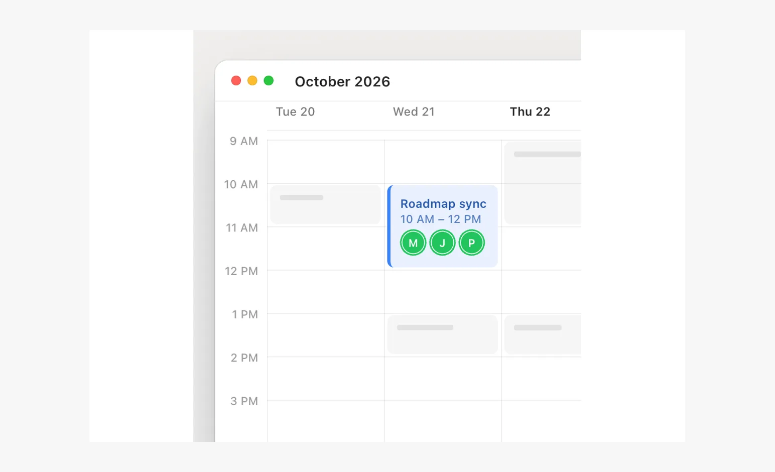
- Calendar dragScenes
A populated week, one focal event, a measured pickup.
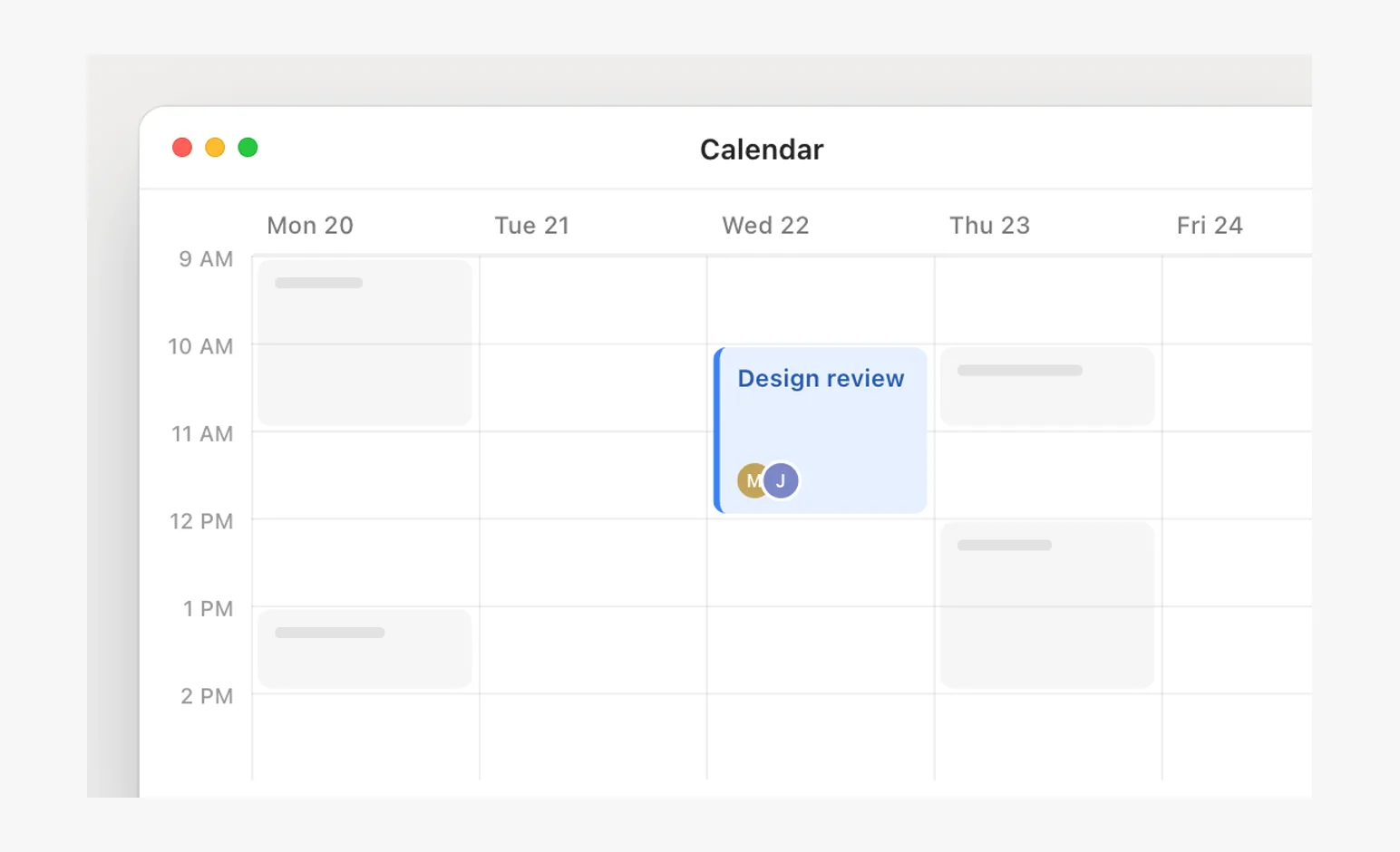
- Drag and dropScenes
Grab offset, a measured grid, a drop slot that snaps.
- Card expansionScenes
A card opens into its screen as one object, and the loop folds back.
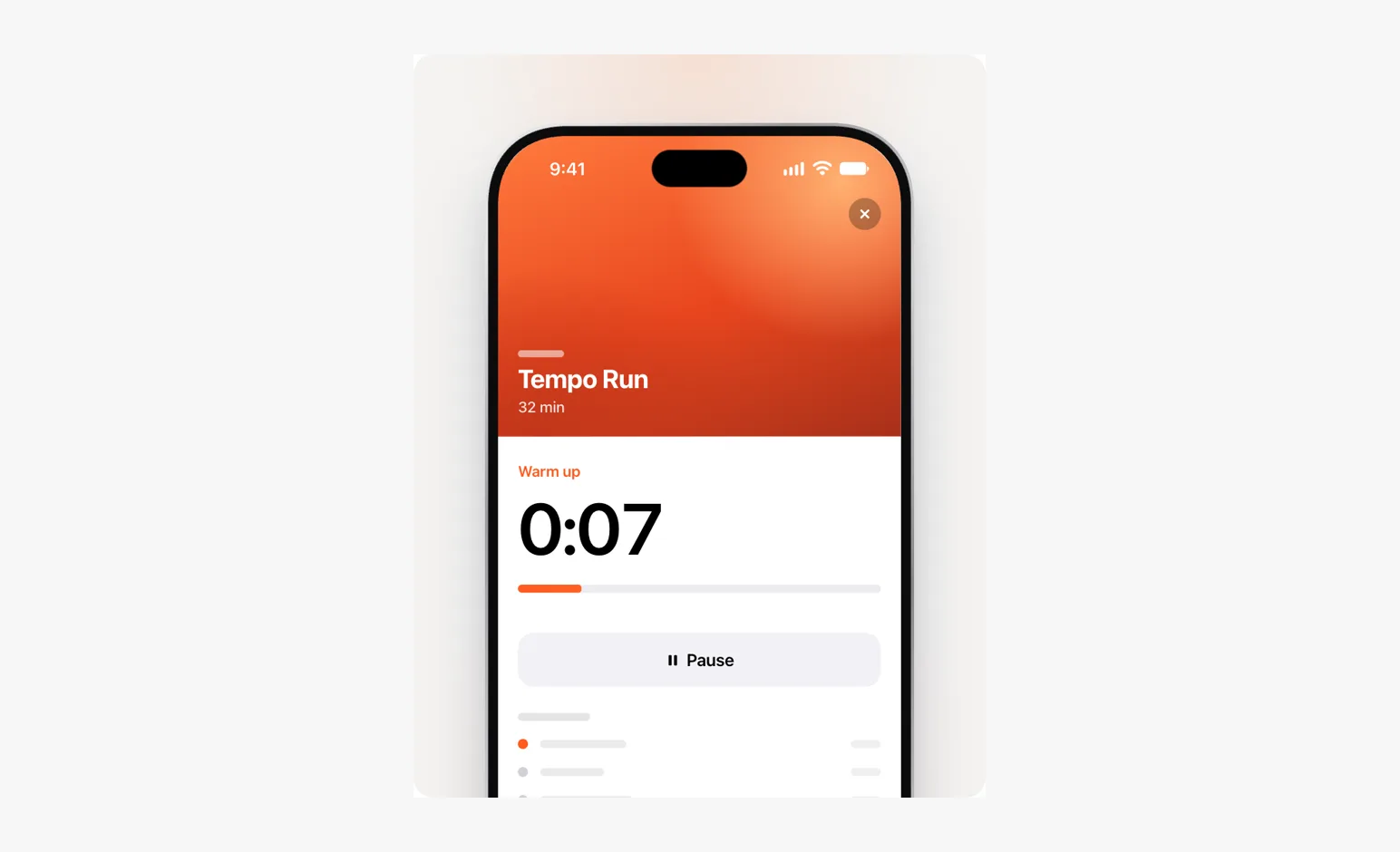
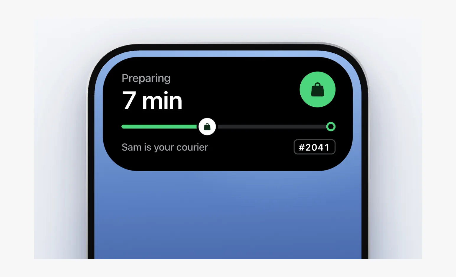
- Dynamic IslandScenes
One black shape, its content a separate layer.
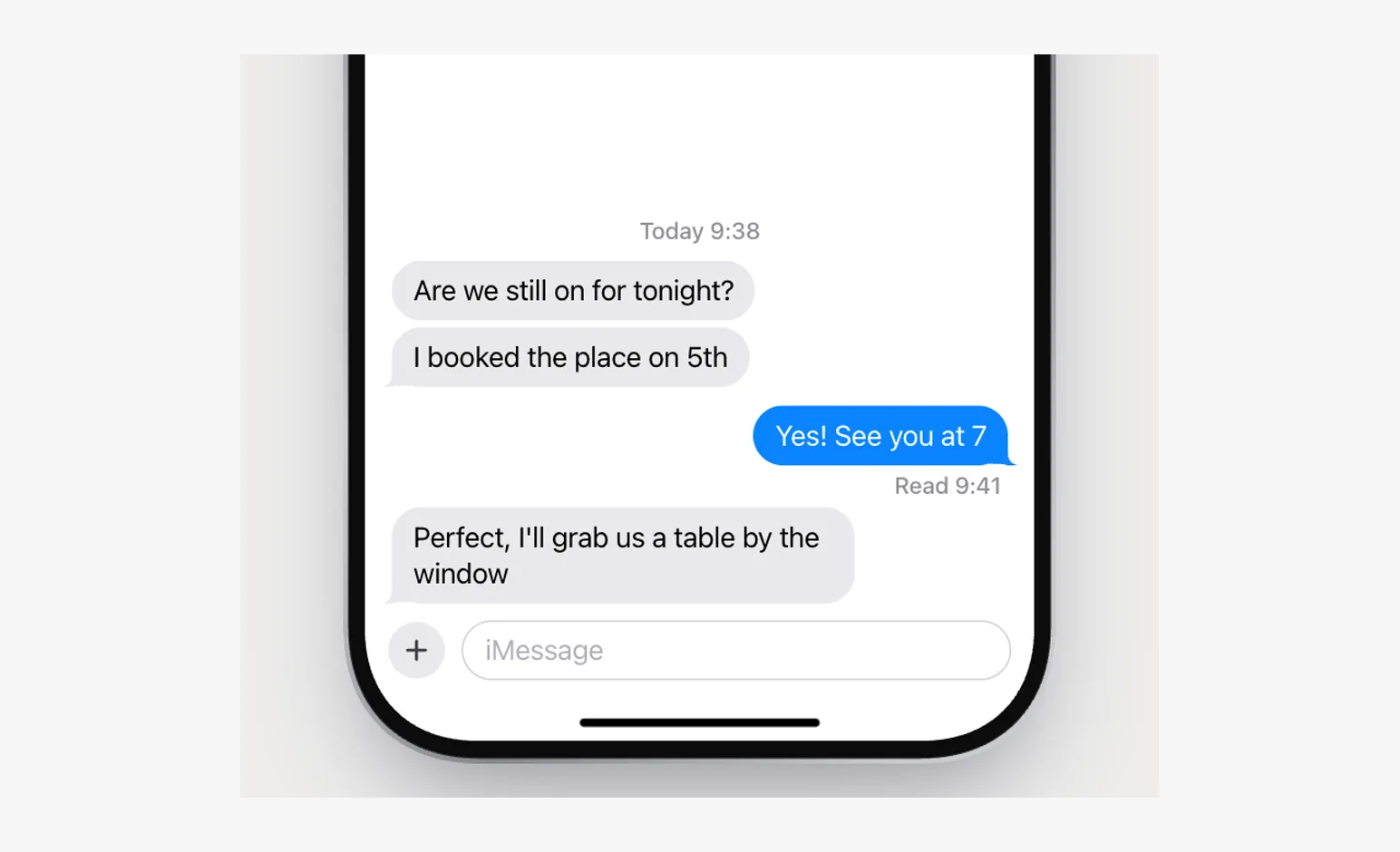
- MessagesScenes
Composer, typing, receipts, a bubble's lifetime.
- Cursor kindsScenes
Cursor kinds and direct feedback across common interactions.
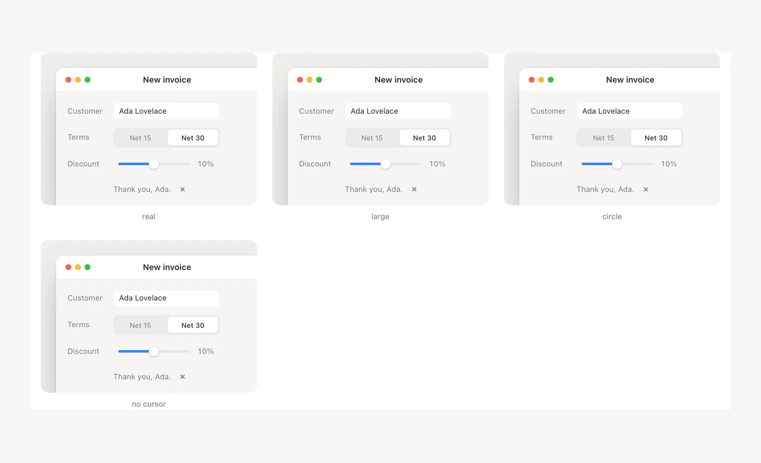
- Cursor morphScenes
One outline becomes four cursor styles. Position, press feedback, and shape share the same stage.
- Resize cursorsScenes
Resize edges and corners, the cursor changing kind as it crosses them.
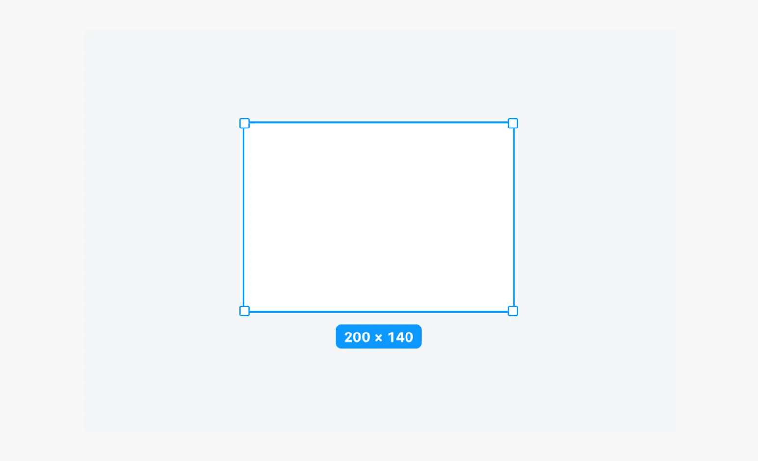
- Annotations and linesScenes
Leaders, dimensions, flows and a moving target.
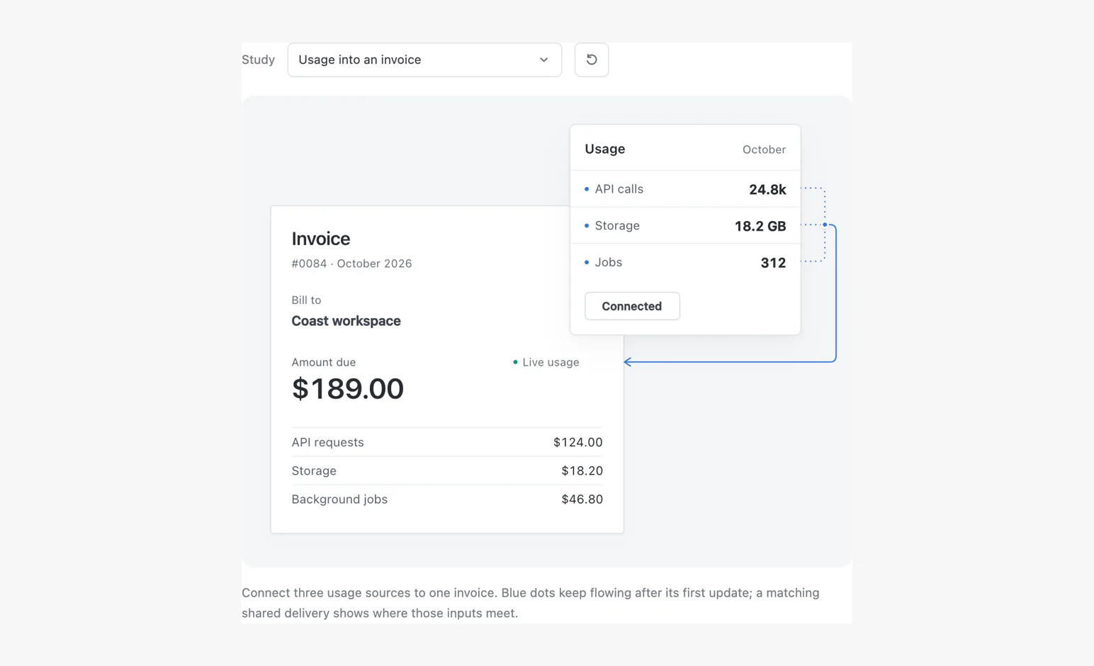
- Feature gridScenes
One hero, one window, a stat, an object, a diagram.
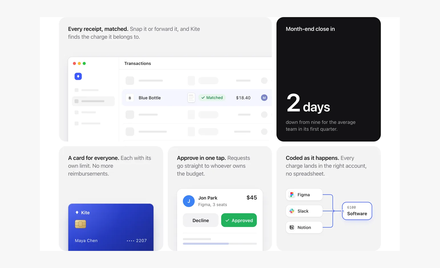
- Technical gridScenes
Shared rules and technical imagery.
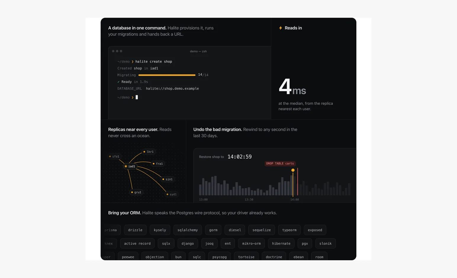
- Consumer gridScenes
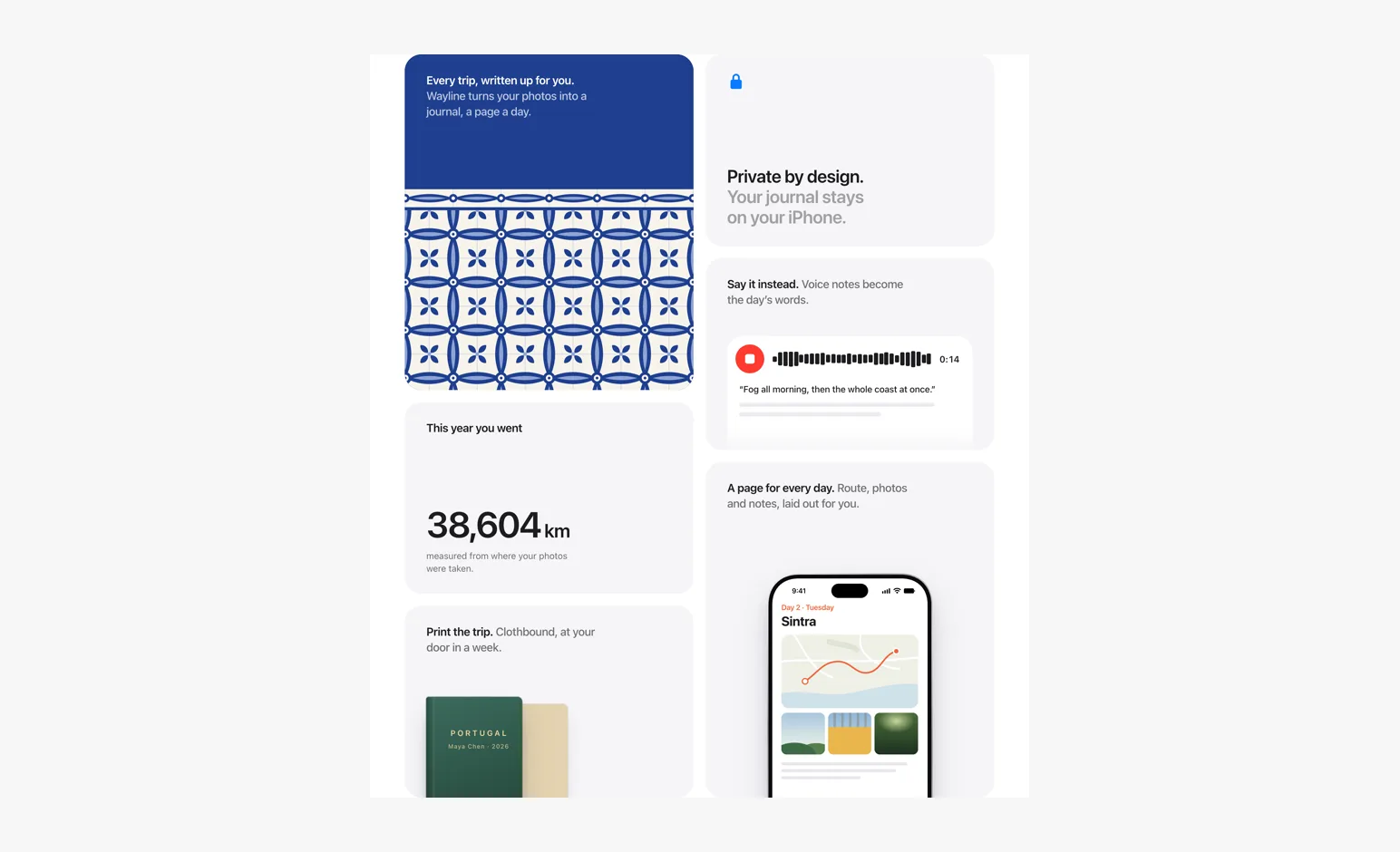
Offset tiles, graphic art, physical objects.
- Hero gridScenes
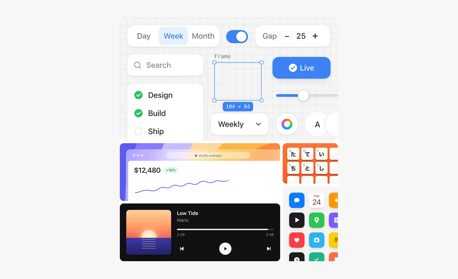
Different grounds and materials composed as one picture.
- UploadScenes
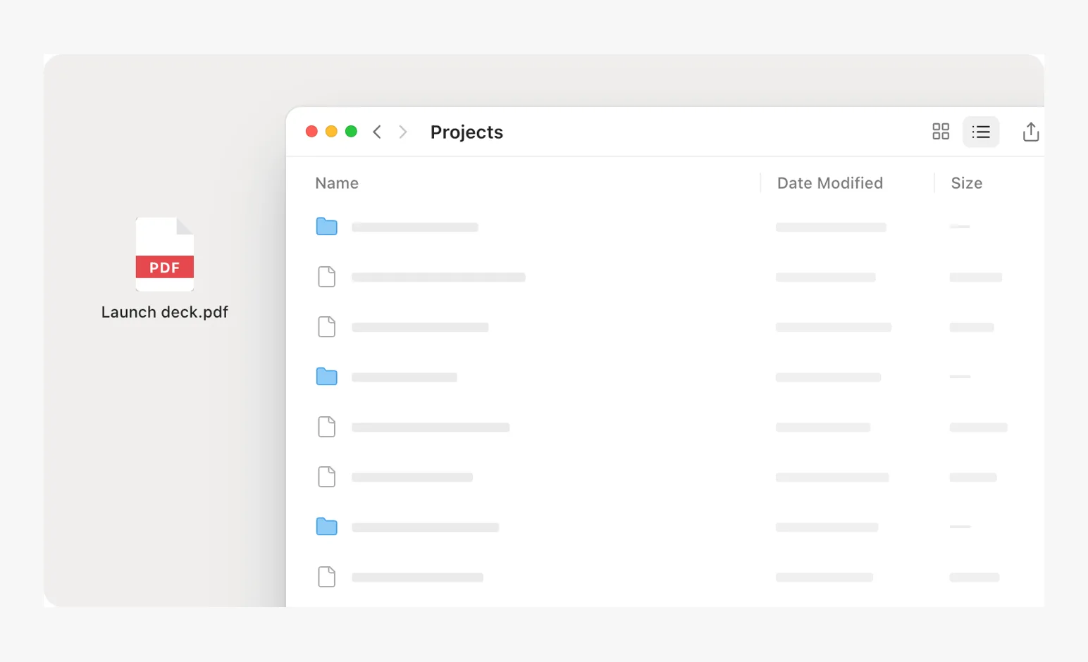
A file dragged in from the desktop, an upload row with progress that settles as a file row.
- ShareScenes
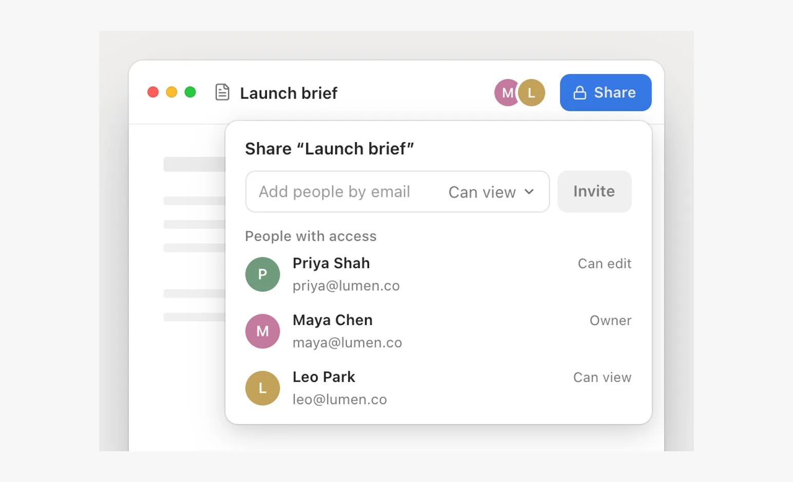
A share popover over a document: an email becomes a chip, a role menu, a person added to the list.
- SwipeScenes
A phone swipe to archive: press, swipe, a throw at the finger's speed, the gap closes.
- ComparisonsComparisons
Paired studies of motion, framing, hierarchy and restraint. Choose a principle to inspect.
- FigmaReal products
Canvas selection, a color picker, a second cursor.
- LinearReal products
Command menu and assignment.
- SlackReal products
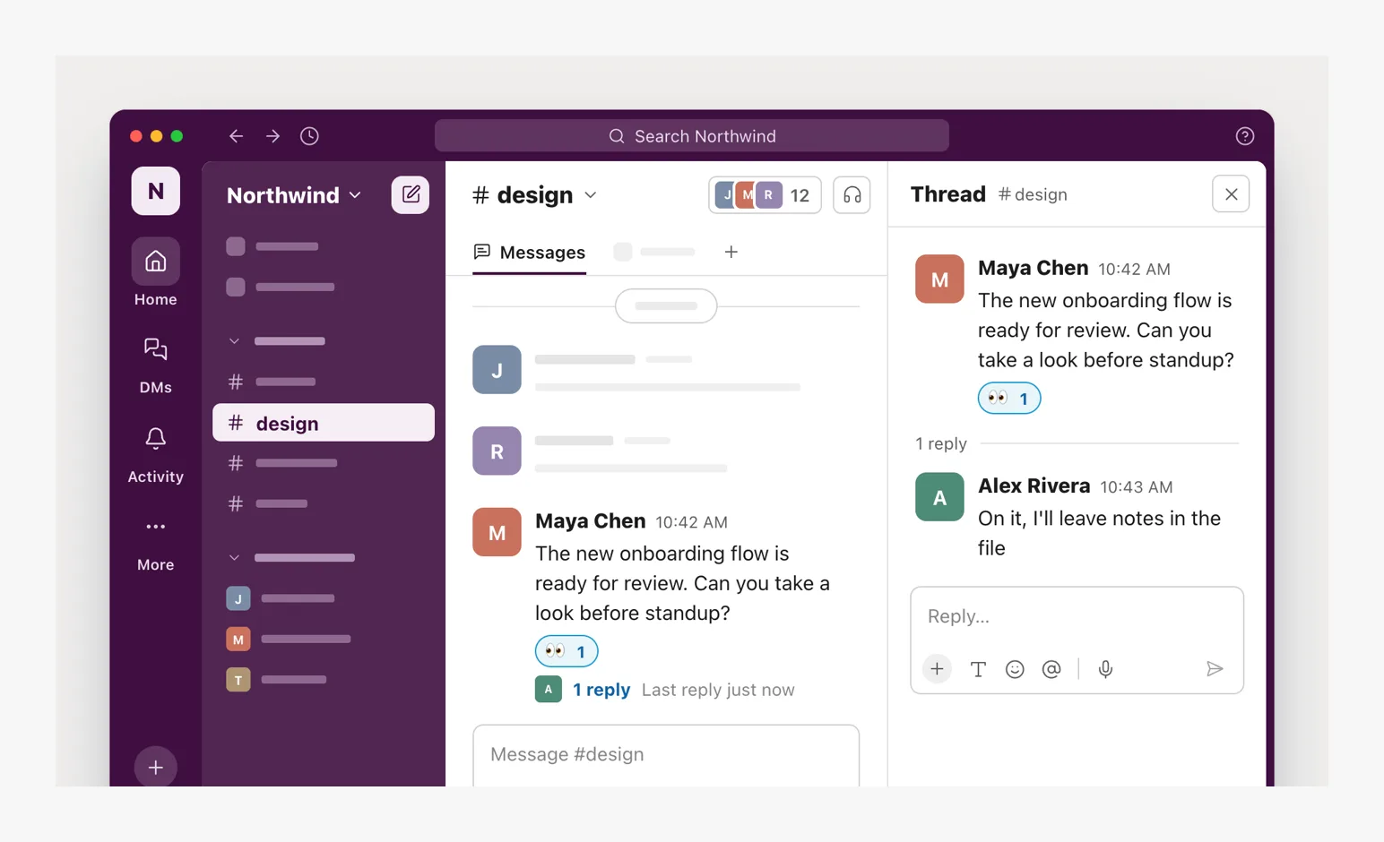
Messages, a reaction, a thread reply.
- RaycastReal products
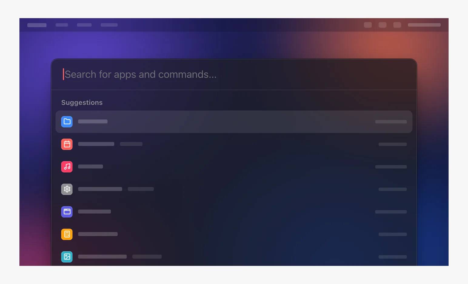
Search and clipboard history over a blurred desktop.
- FinderReal products
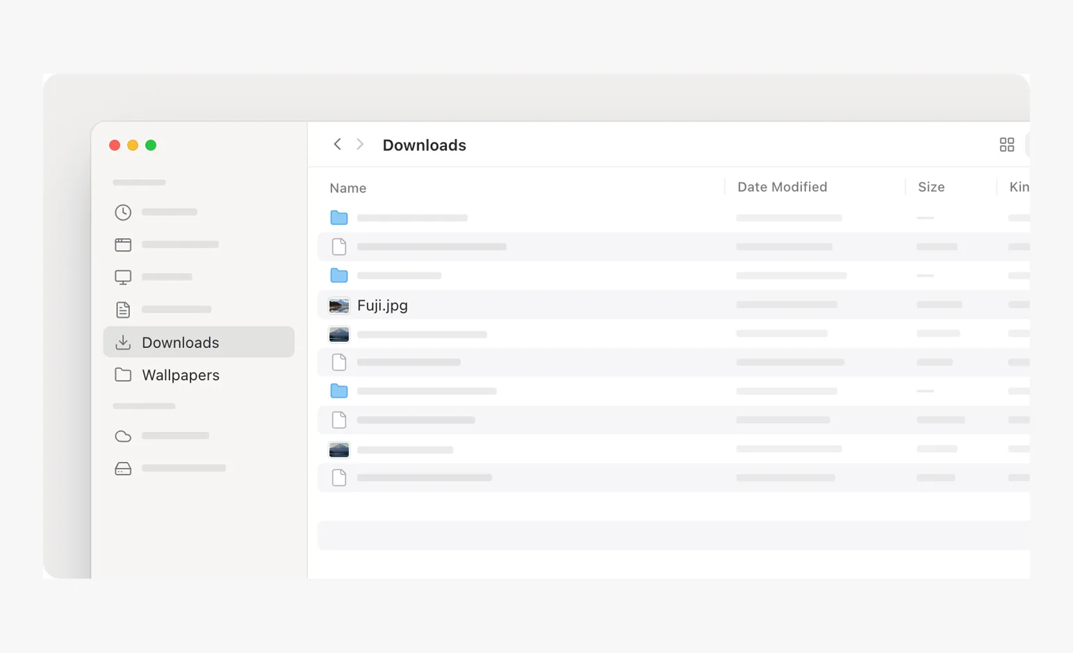
Quick Look over a file list; a file moved into a folder; the same window in frosted glass.
- Finder · glassReal products
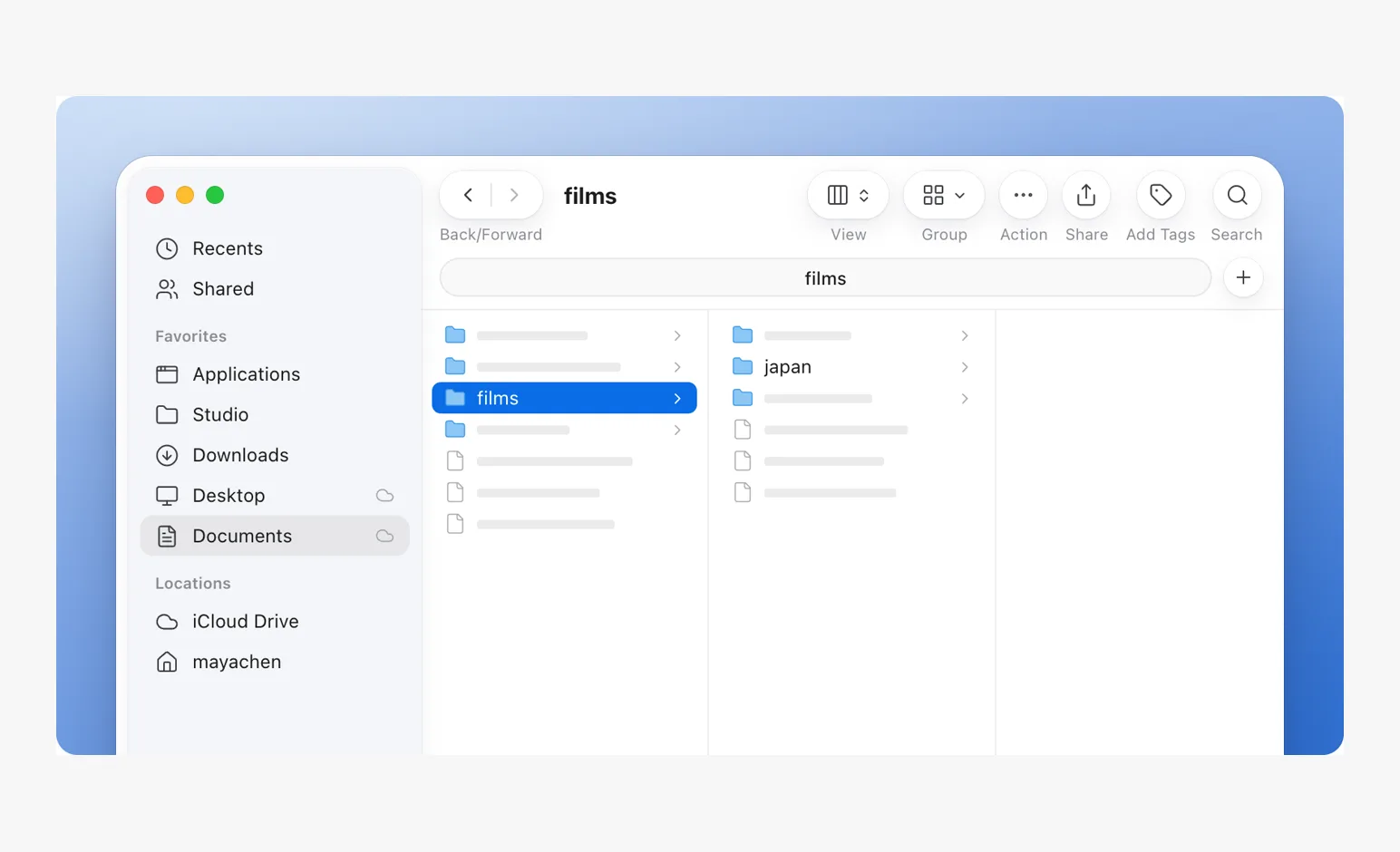
Quick Look over a file list; a file moved into a folder; the same window in frosted glass.
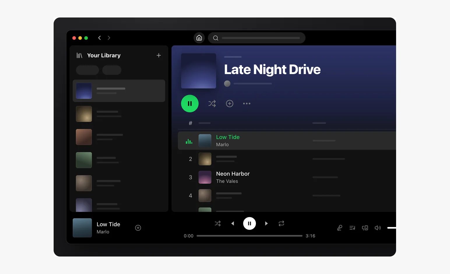
- SpotifyReal products
A dark desktop app with album art.
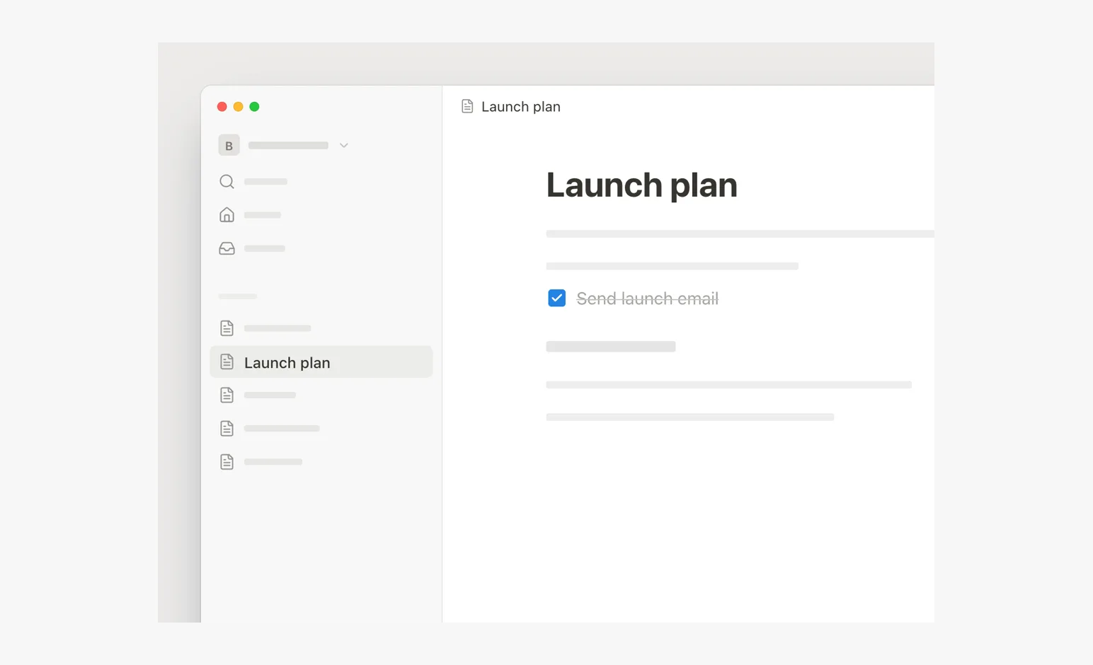
- NotionReal products
A slash command; a comment and its reply.
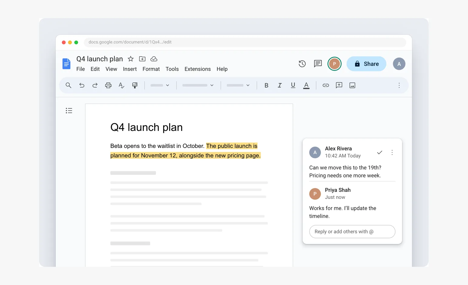
- Google DocsReal products
A slash command; a comment and its reply.
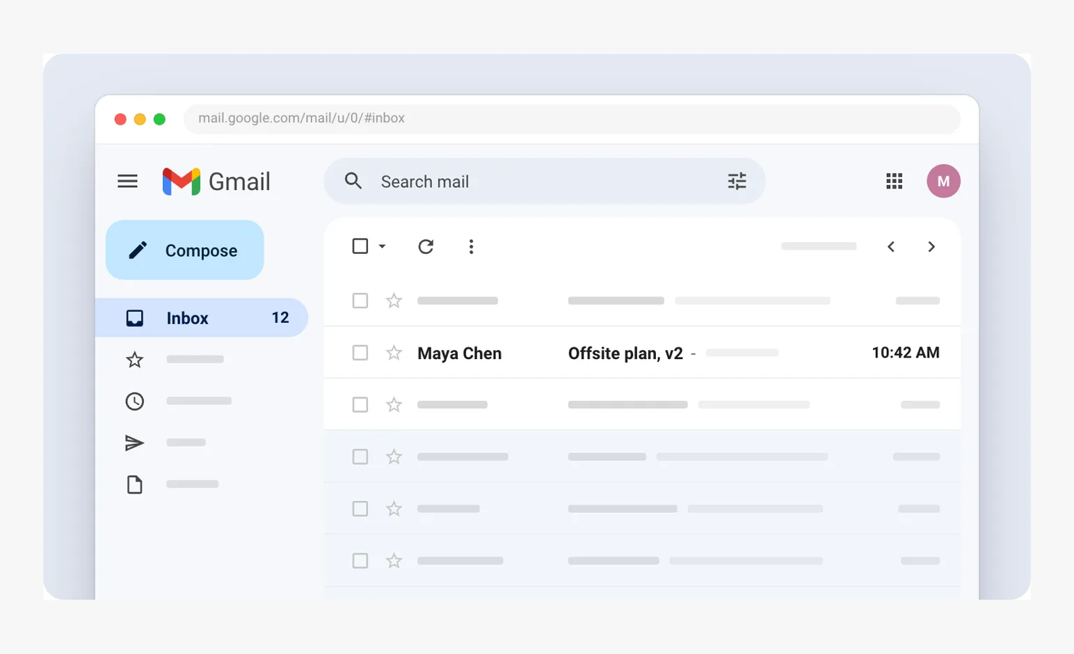
- GmailReal products
Hover actions, archive, an undo toast.
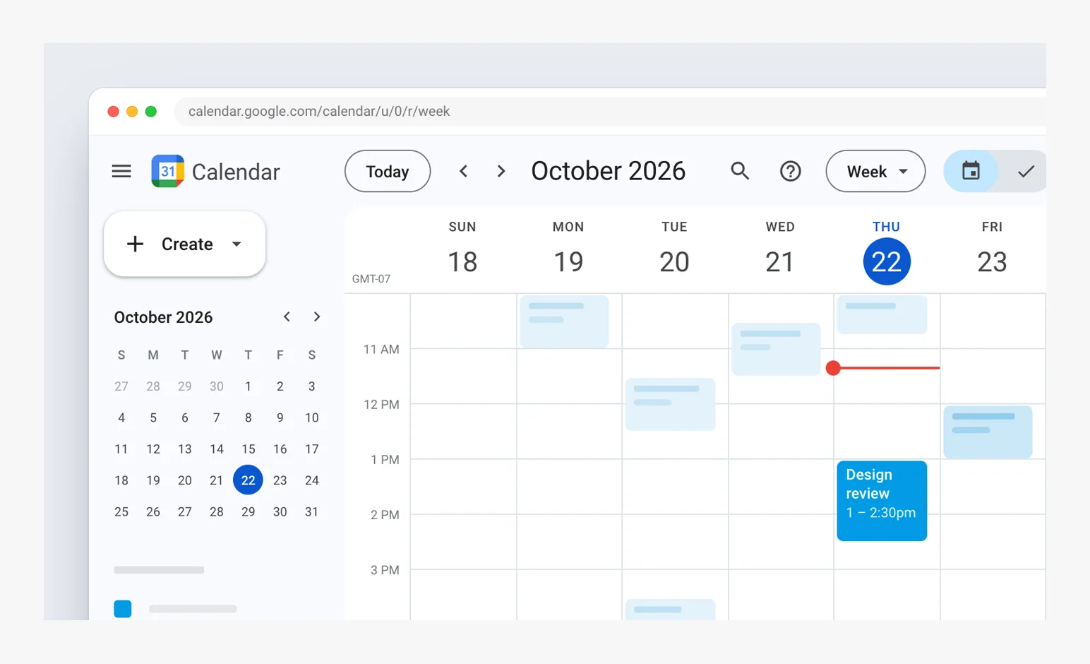
- Google CalendarReal products
Drag to create an event, the quick-create popup.
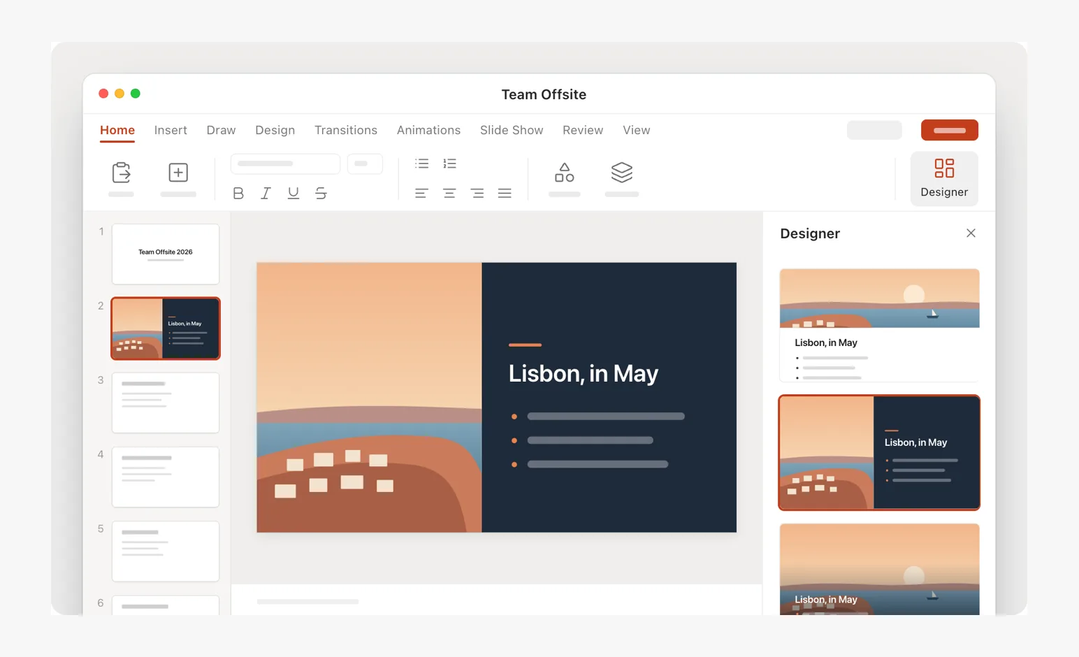
- PowerPointReal products
Slide editing; AutoSum and a chart.
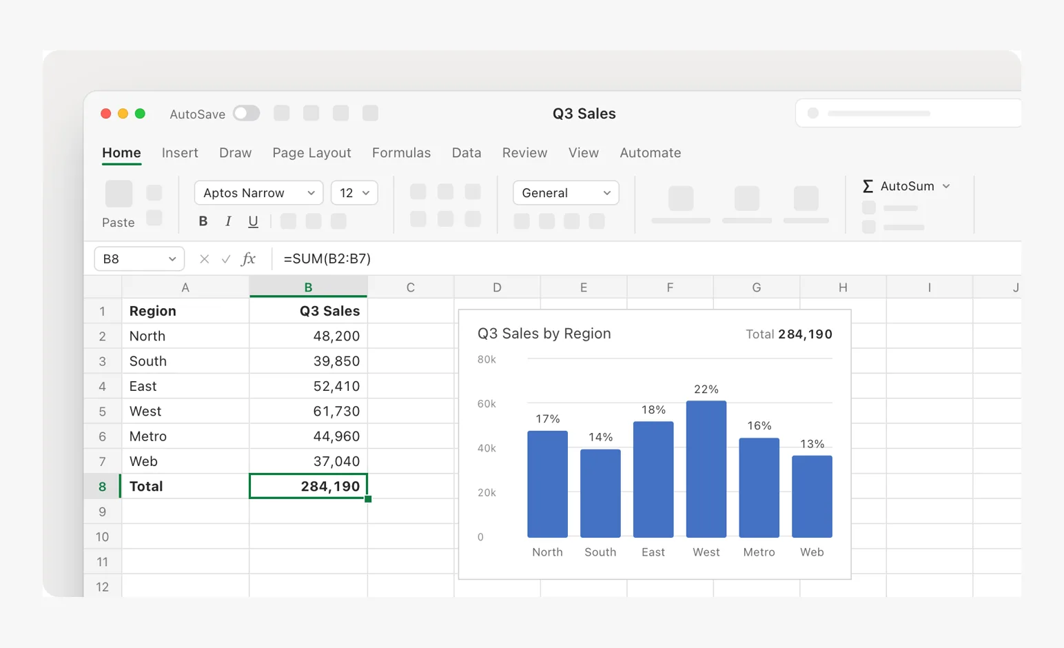
- ExcelReal products
Slide editing; AutoSum and a chart.
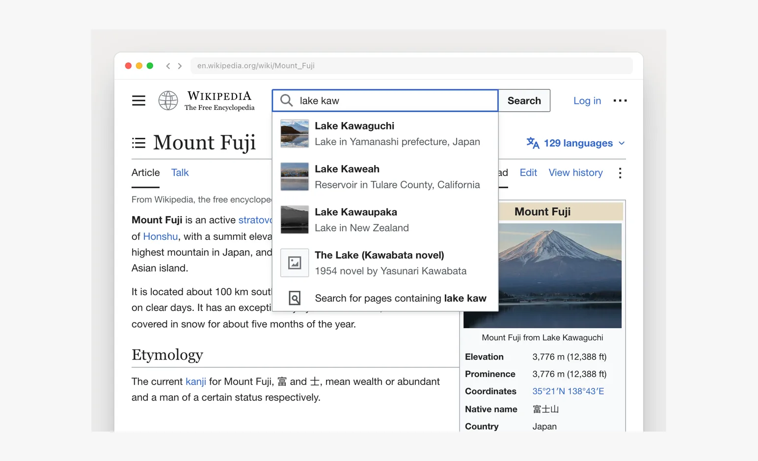
- WikipediaReal products
Search suggestions in a browser.
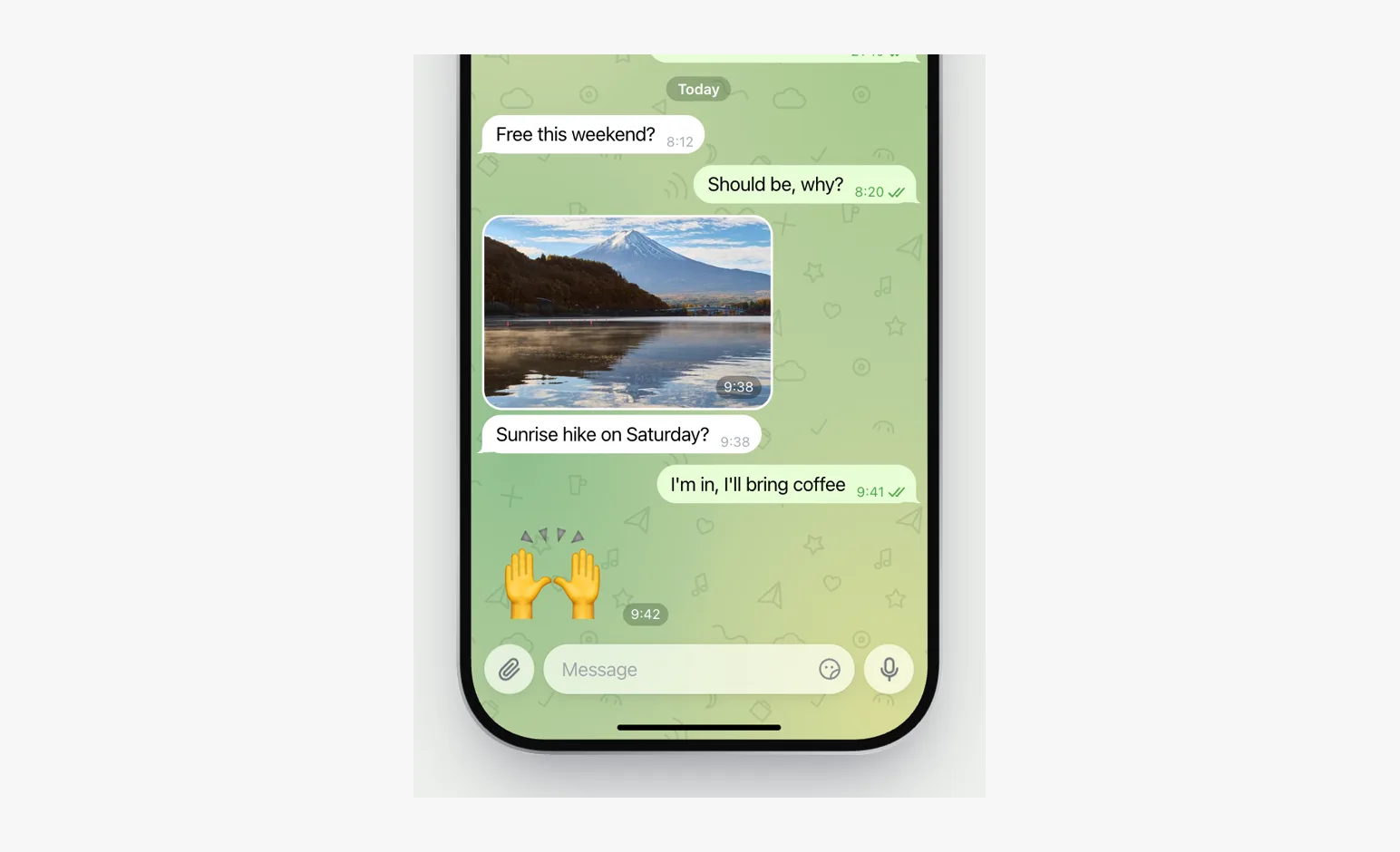
- TelegramReal products
Native chat apps on an iPhone.
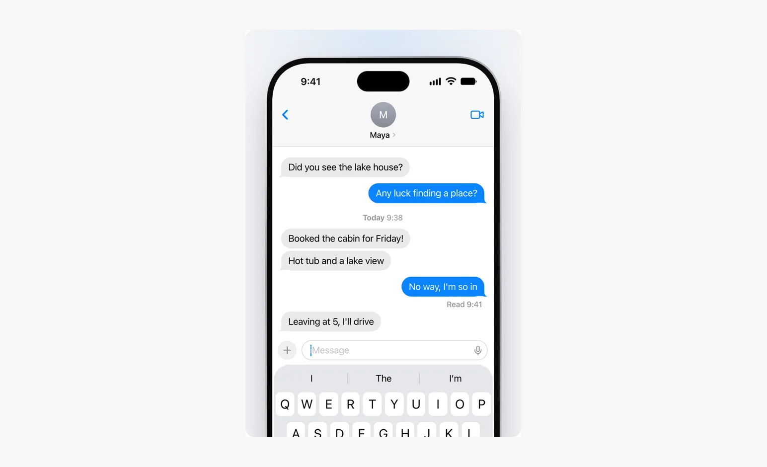
- iMessageReal products
Native chat apps on an iPhone.
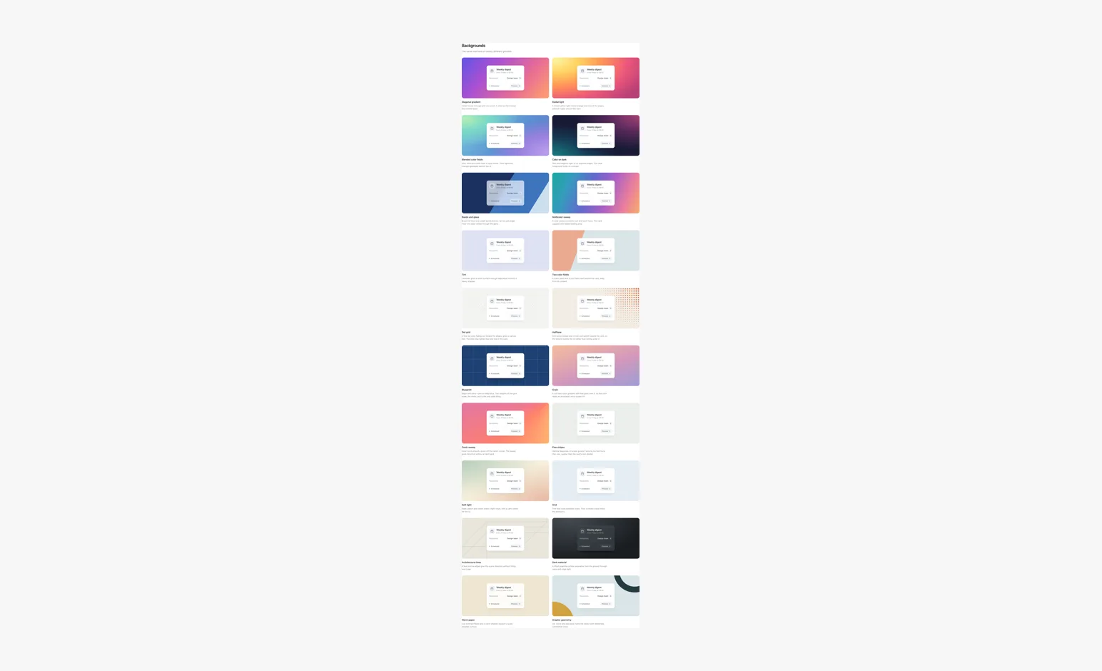
- BackgroundsKit
One interface over twenty grounds: colorful gradients, light, linework and material.
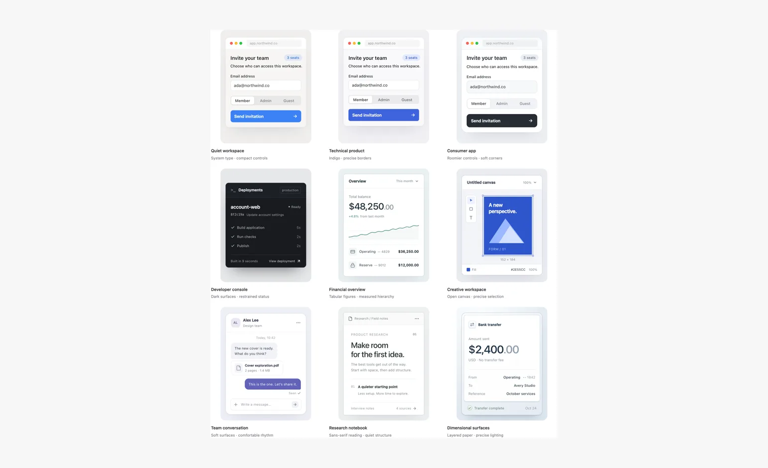
- Visual stylesKit
Type, shape and color working together. Treat the kit defaults as a starting point.
- Brand marksKit
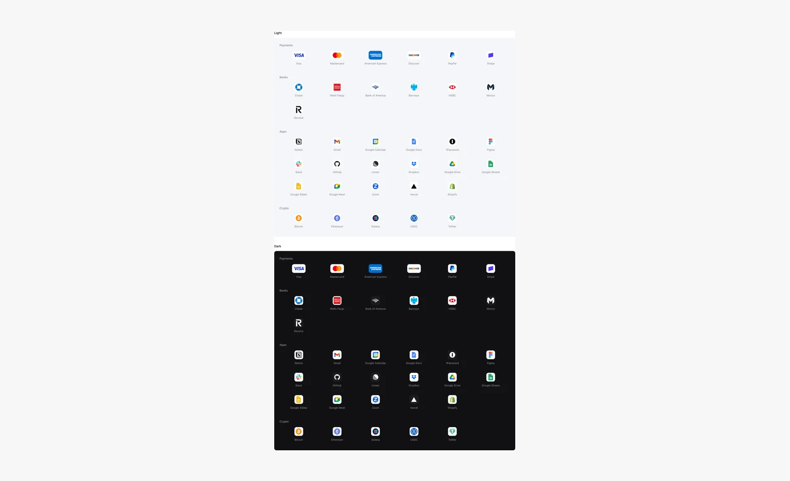
Common payment, app, bank and crypto marks, with original artwork on light and dark surfaces.
- Window chromeKit
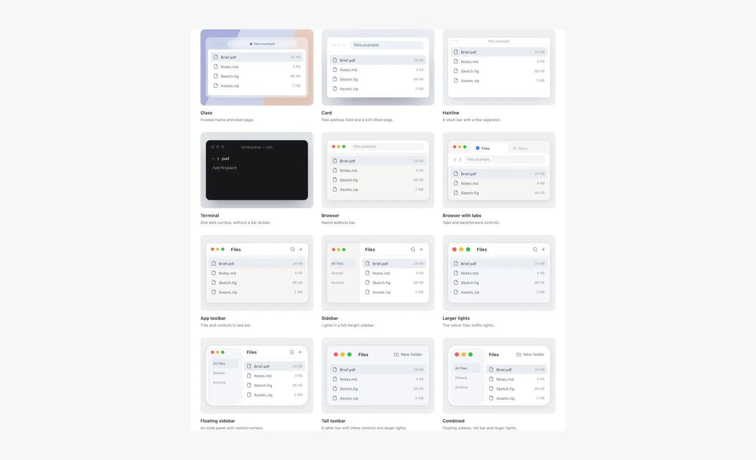
Twelve window frames, including glass with an inset page, card, hairline and native browser variants.
- PhonesKit
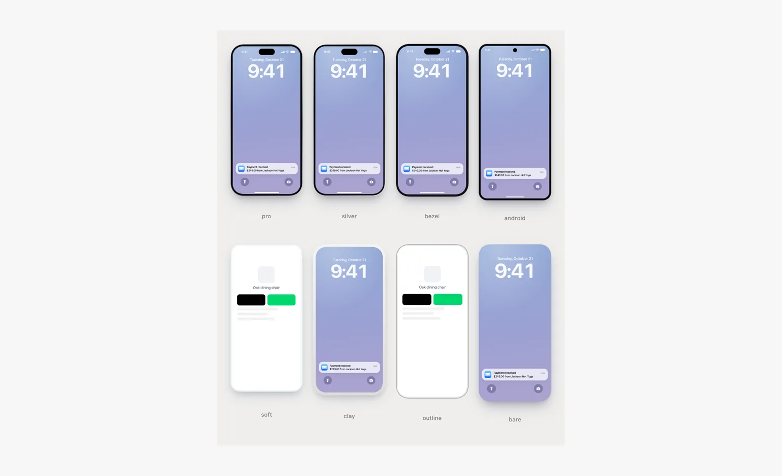
Every phone frame in the kit.
- ControlsKit
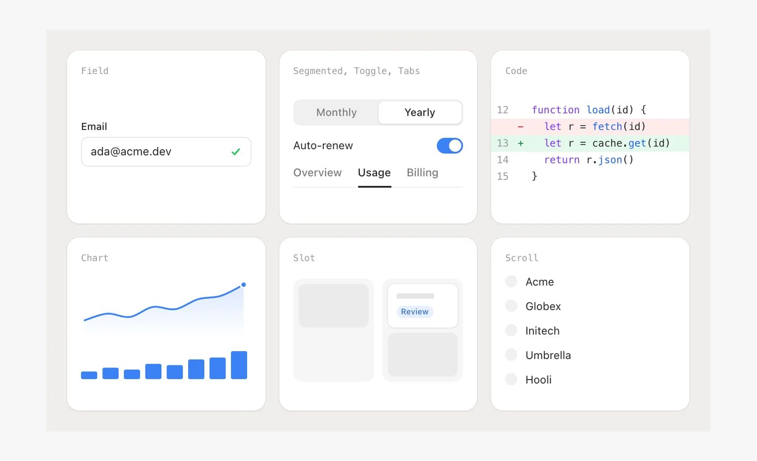
Field, Segmented, Toggle, Tabs, Code, Chart, Slot, Scroll and a Camera push-in.
- PartsKit
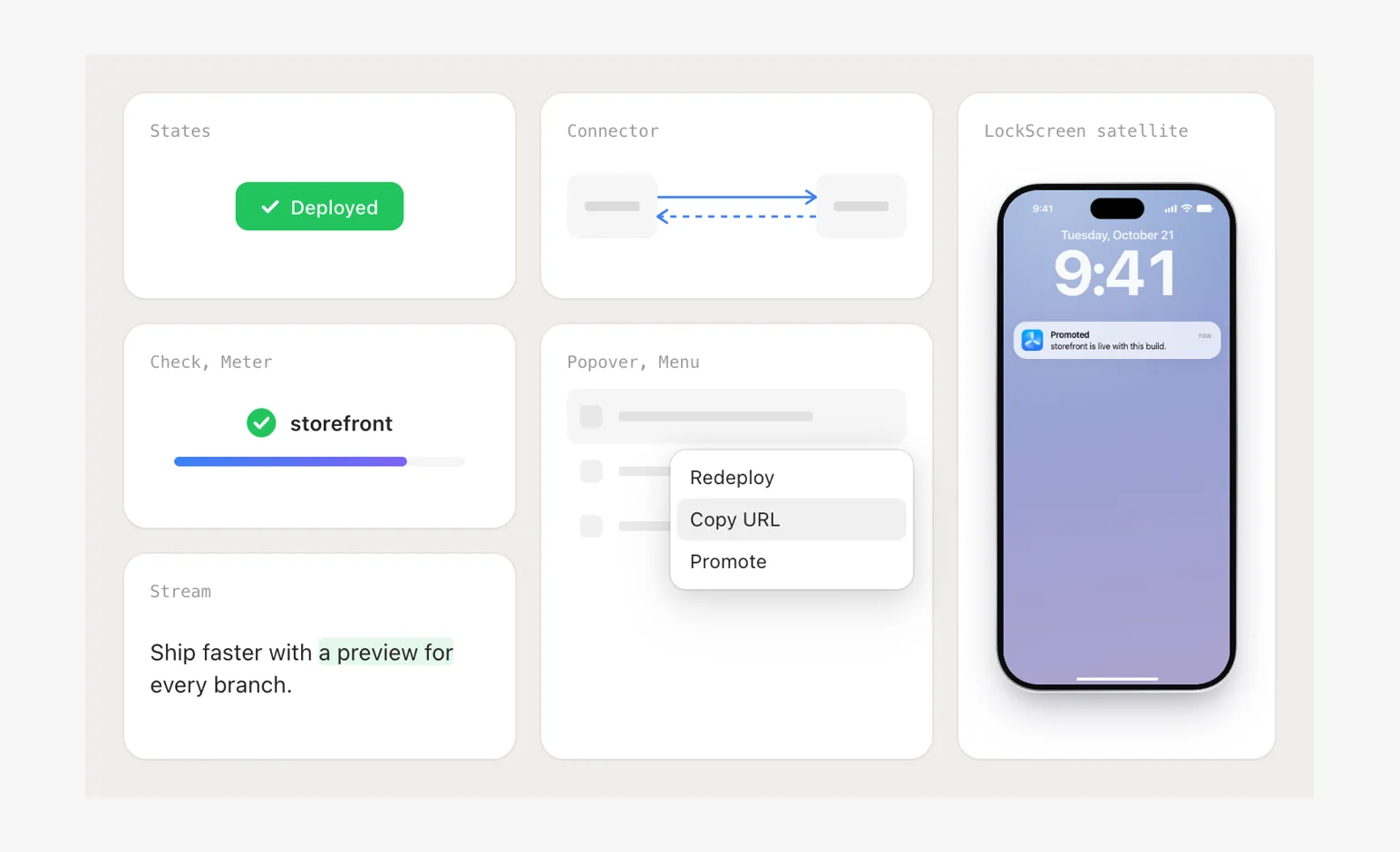
States, Check, Meter, Stream, Connector arrows, Popover and Menu, the satellite lock screen.
- ButtonsKit
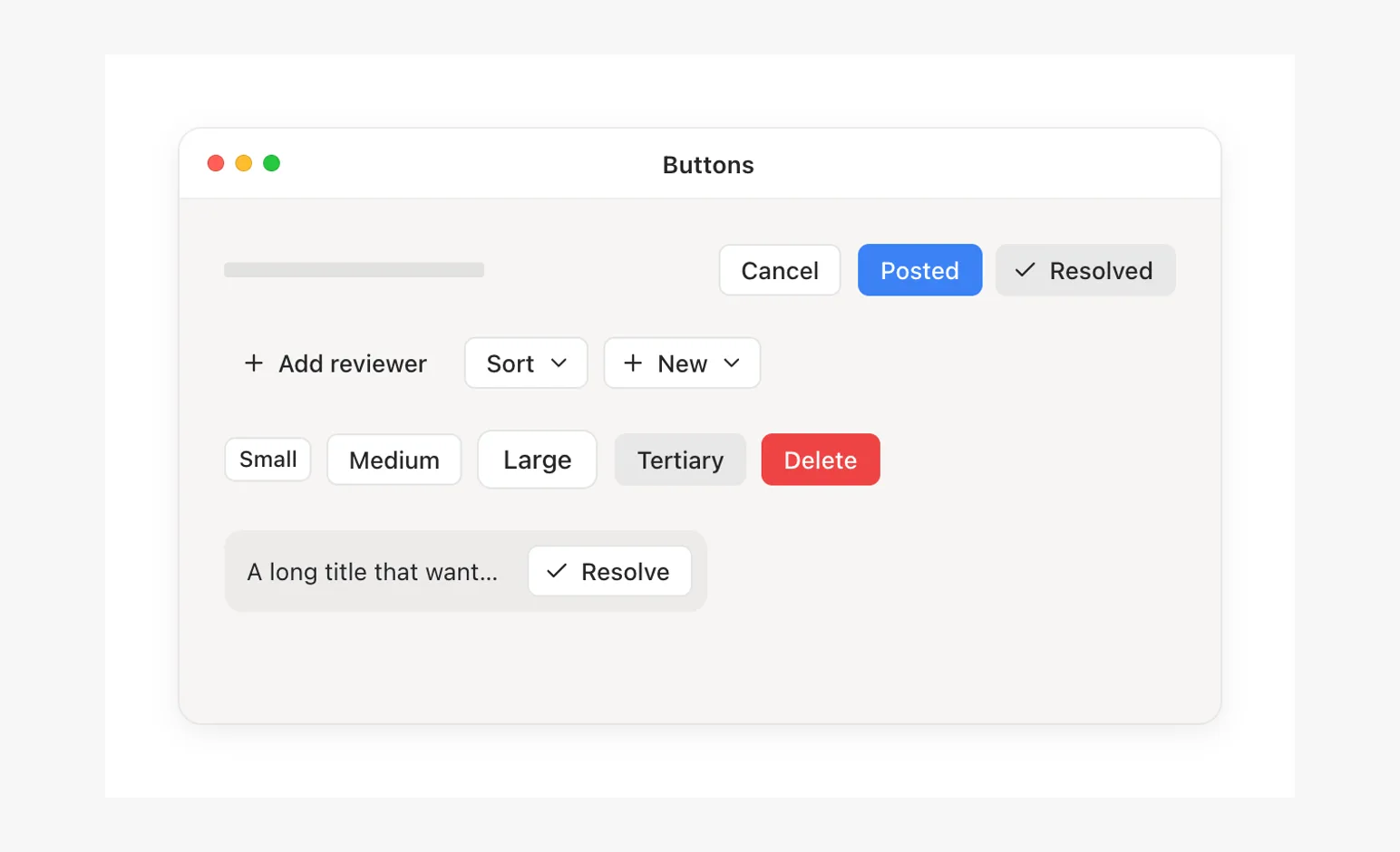
Every Button variant and size, labels that change width beside neighbors, an icon that arrives later.
- CardsKit
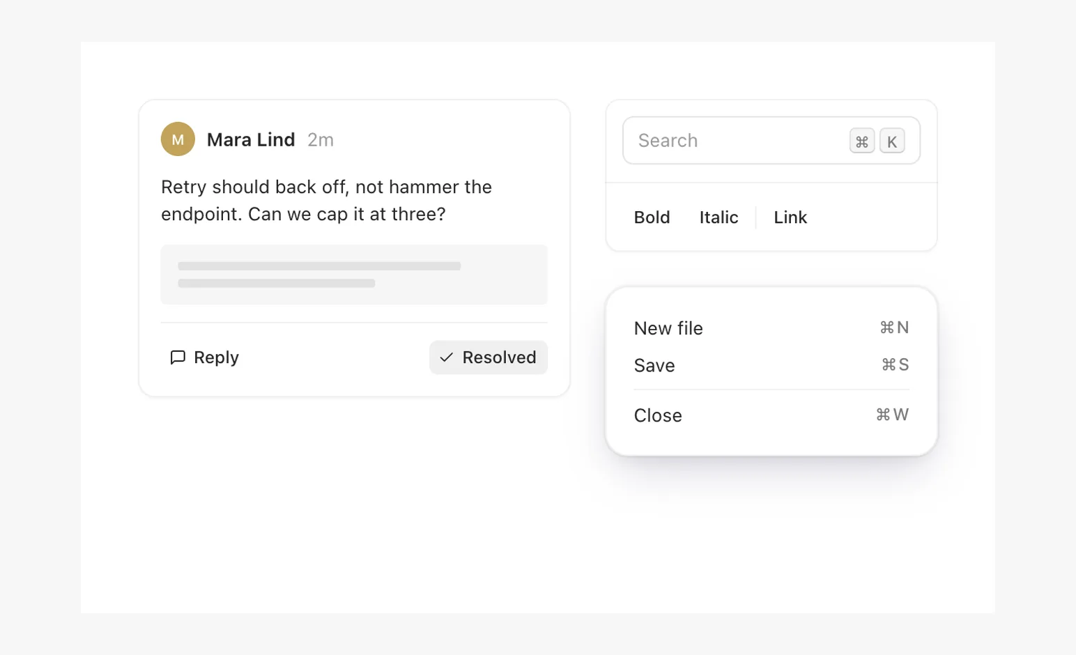
Card padding and nested radius, Divider in a card and a toolbar, Kbd shortcuts.
- Kit extrasKit
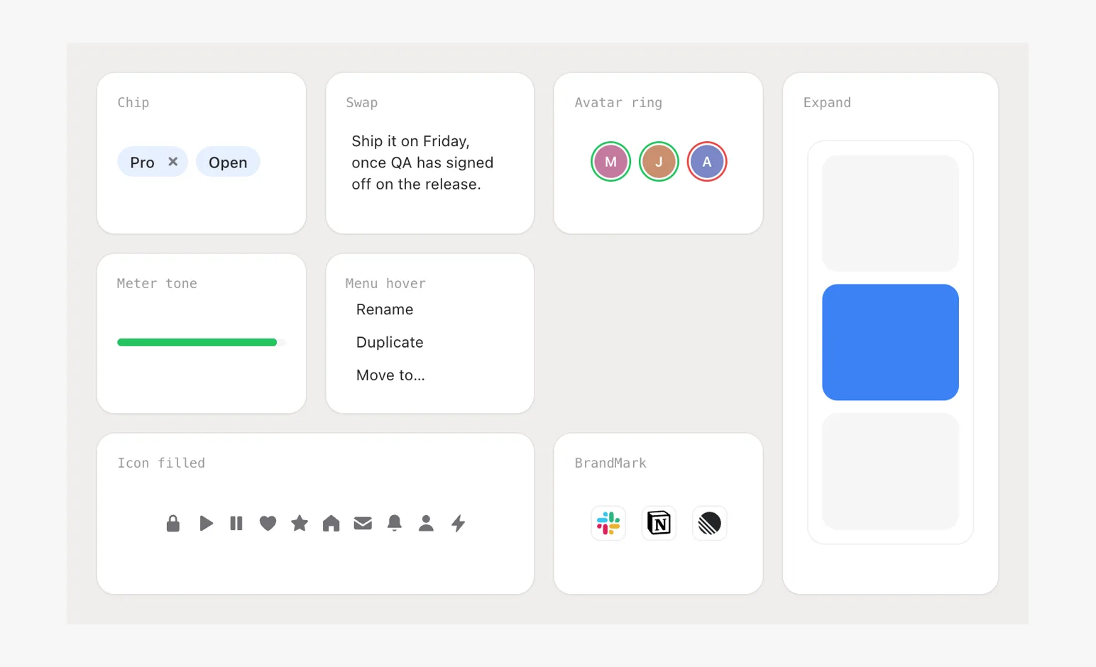
Chip, Swap, Avatar rings, Meter tones, Menu hover, Expand, solid glyphs, BrandMark.
- GlassKit
The glass theme on a window, a chip and a popover.